While working on the branding for “Byarozavik” and searching for a suitable name, our focus was on fulfilling the client’s main request: to have a proper name written in Latin letters for their product, which is birch sap.
BYAROZAVIK brand took the first place in the nomination Design & Art Direction / label and packaging / at the II festival of belarusian advertising and kamunikatsy AD.NAK 2011
Client:
CJSC “MZBN”
Our services:
brandingnaminglogopackaging designadvertising photography3D product visualization
Naming and logo design
The name “byarozavy sok” was discovered through research on logo design and additional information about birch sap, which was then abbreviated to “birch sap.”
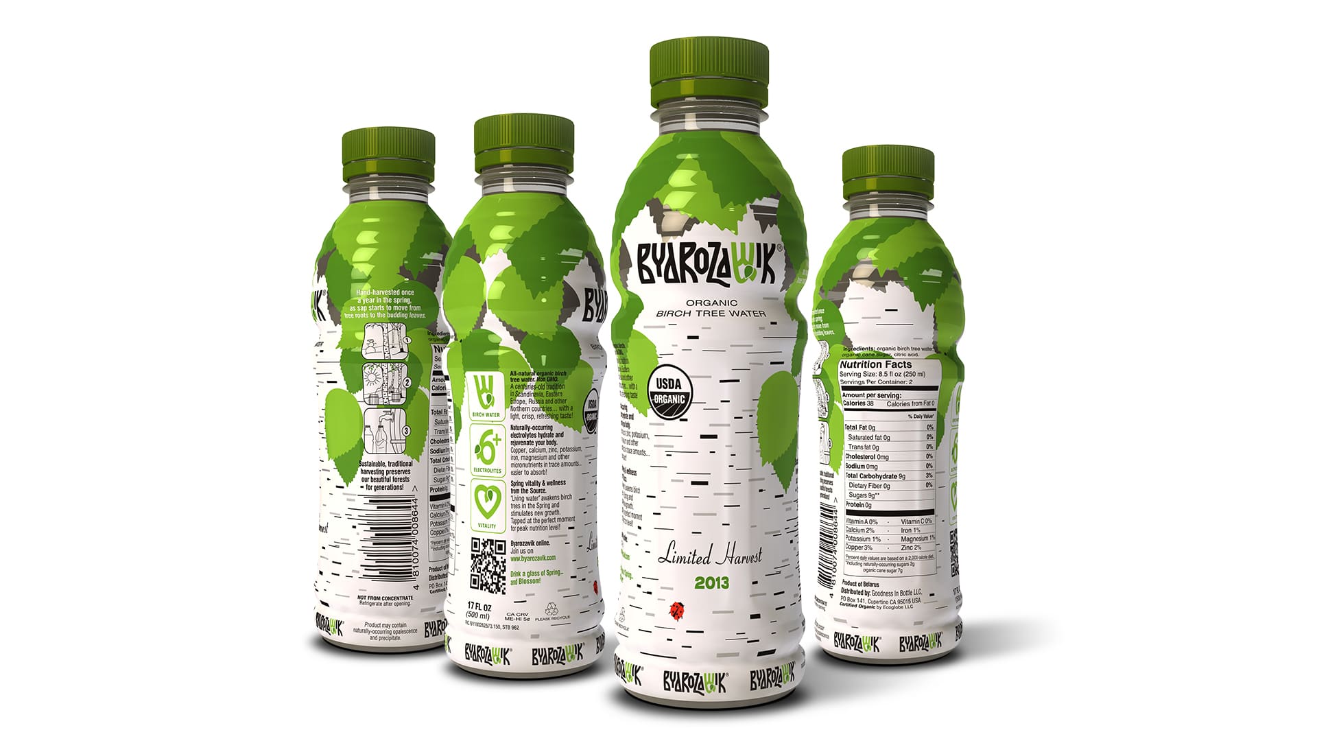
The success of naming was the foundation for further development of the “Byarozavik” branding style. The logo creation was based on the Cyrillic alphabet, with the main graphic element being the stylized “little yus” – a letter found in the Old Slavic alphabets, Cyrillic and Glagolitic. In the Latin alphabet, the inverted “small yus” corresponds to the letter V.
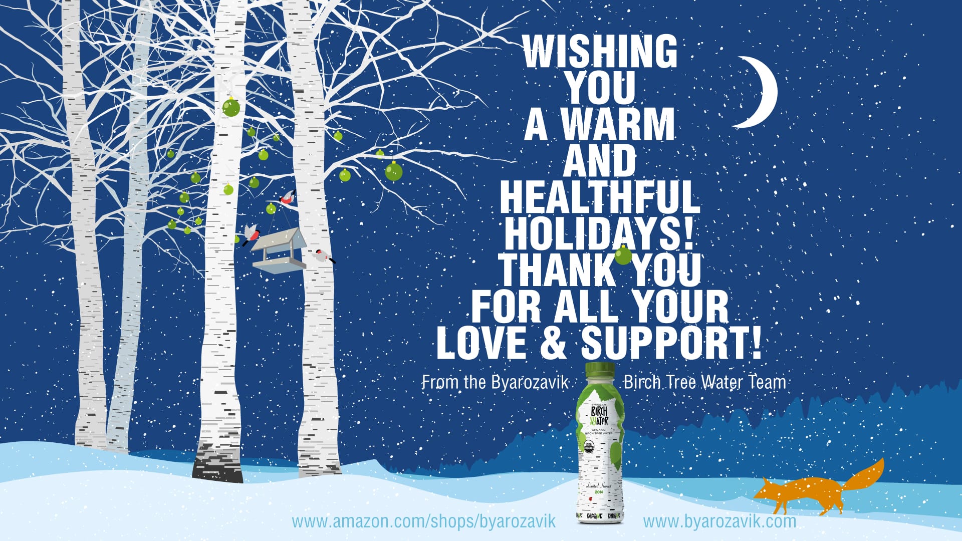
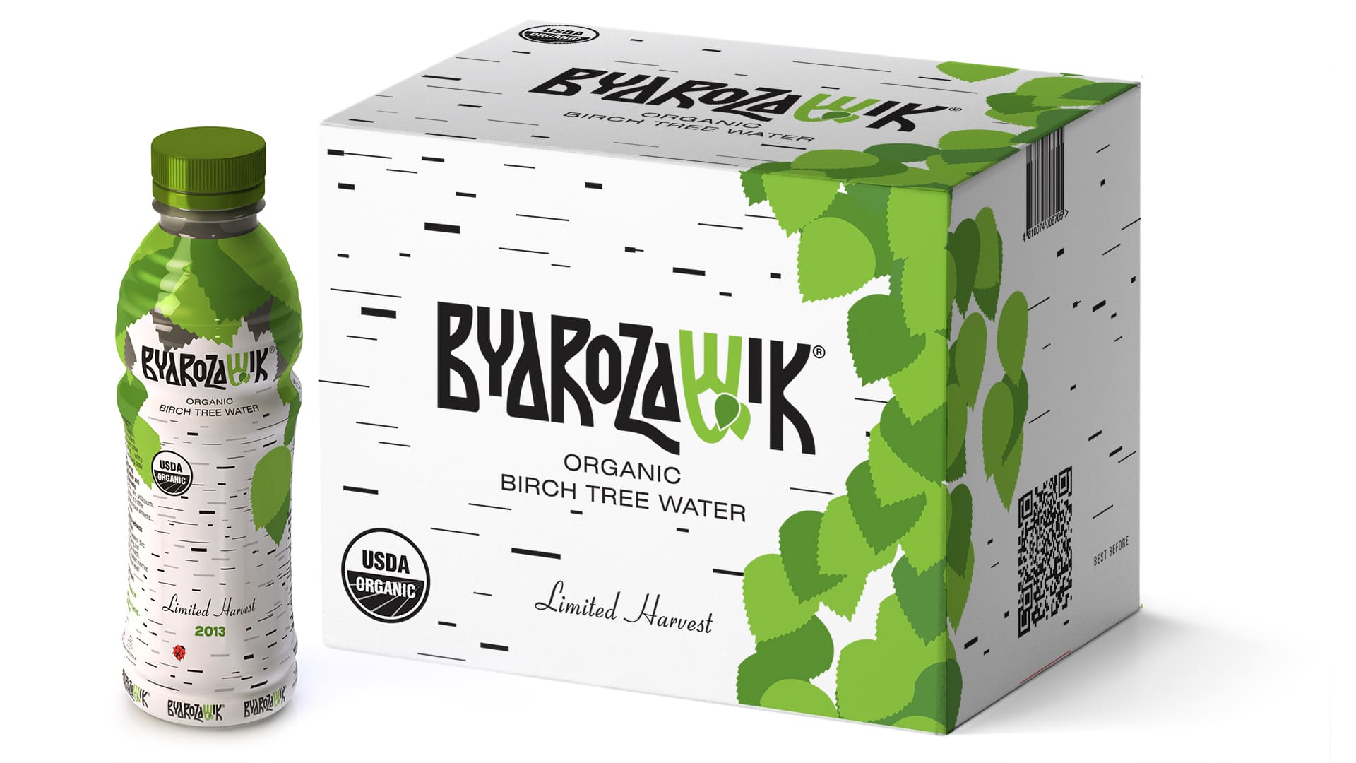
The logo reflects the ancient traditions of collecting and consuming birch sap, while the green color and two leaves represent ecology and cleanliness.
Packaging design
The collection of birch sap is conducted using ancient techniques that involve extracting the sap from specific birch trees on a particular side of the trunk, while minimizing its exposure to air.
The design of the packaging was developed with the core concepts of tradition, ecology (referring to the place of juice collection), and purity (ensuring the production is free from preservatives) in mind.
To achieve a natural and organic look that aligns with the product’s concept, the packaging design features graphic stripes resembling birchbark and green birch leaves.
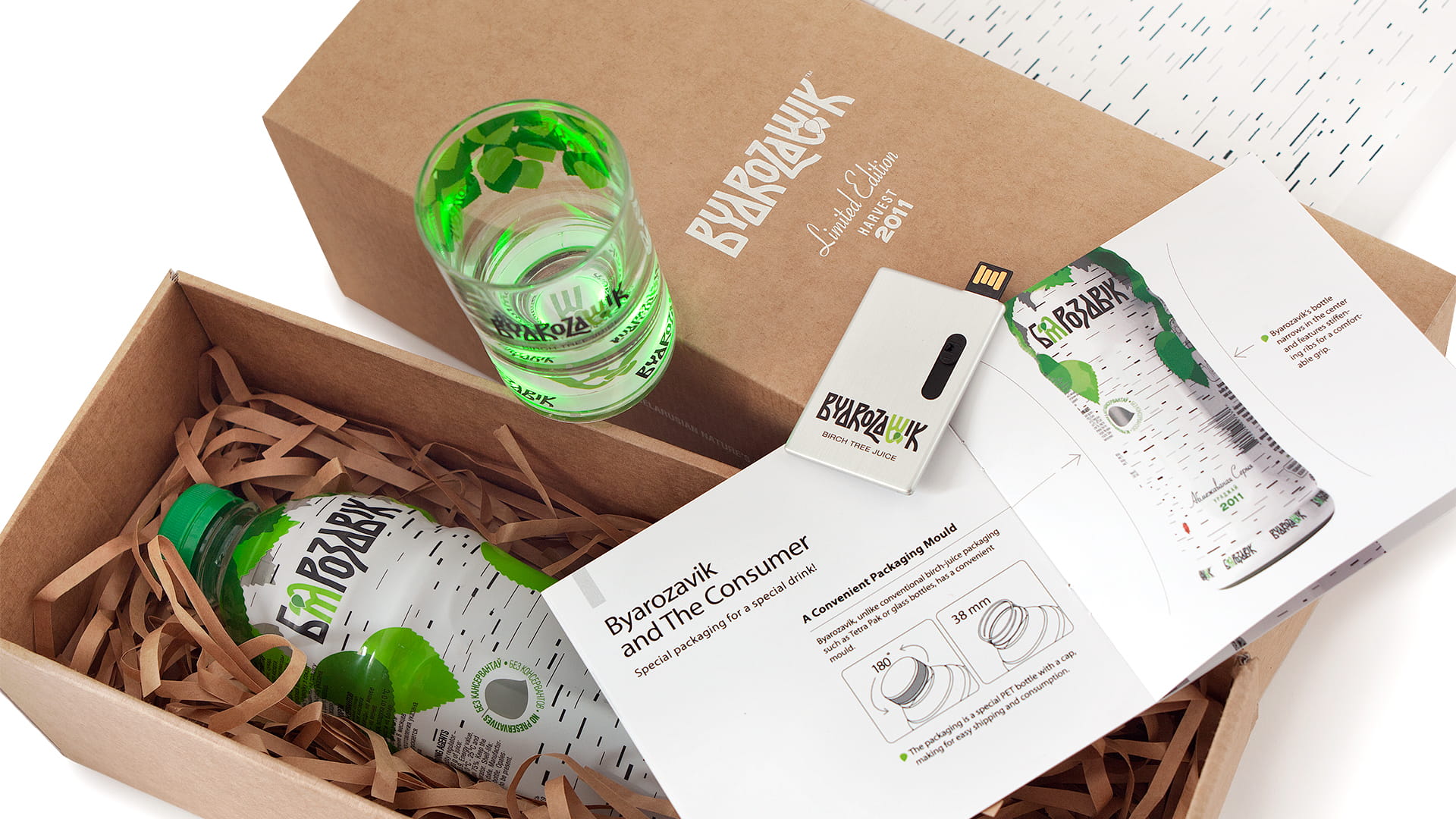
Presentation kit
Some time later, we created a presentation set of the birch juice “Byarozavik” for foreign retail chains. The idea of natural and ecological compatibility dictated the choice of materials: for the box we took regular corrugated cardboard, a minimum of paint, plastic and other unnatural materials. The set includes a bottle of birch juice, a glass glowing with the touch of a hand, a paper stand, a booklet and a flash drive with a presentation. Only a few dozen such kits were made.

Overall, the creation of the “Byarozavik” juice brand and packaging design reflect the authenticity of the product and commitment to traditional methods, while emphasizing its environmental friendliness and purity.
The name, logo and packaging work together to create a coherent brand identity that accurately reflects the values and quality of the product.