Inspiration: truffles and oak groves
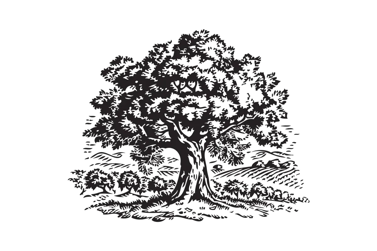
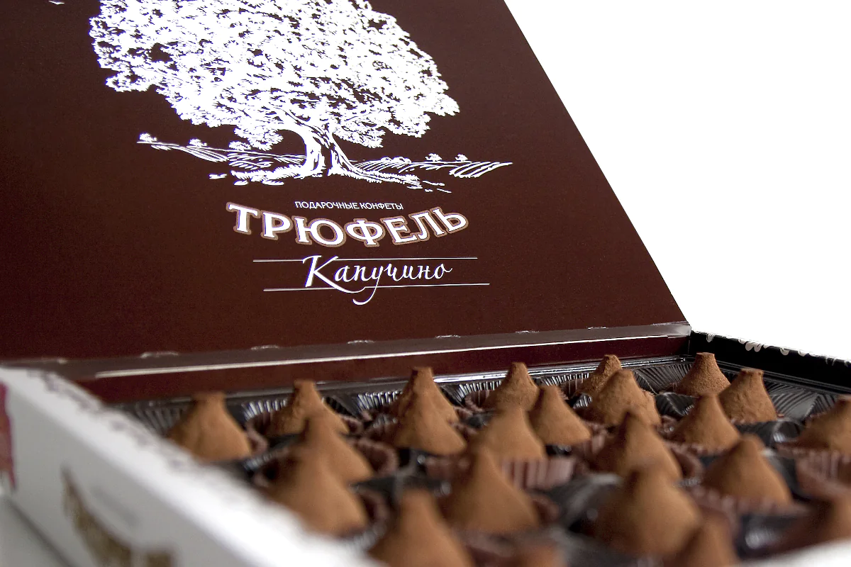
The connection between truffles and oak groves inspired the key symbol – the oak, which became the foundation of the packaging concept. It added depth and emotion to the design, while giving the brand recognizability and a premium positioning.
When it comes to confectionery products, packaging design must instantly communicate brand value and highlight uniqueness.
A symbol that builds the brand
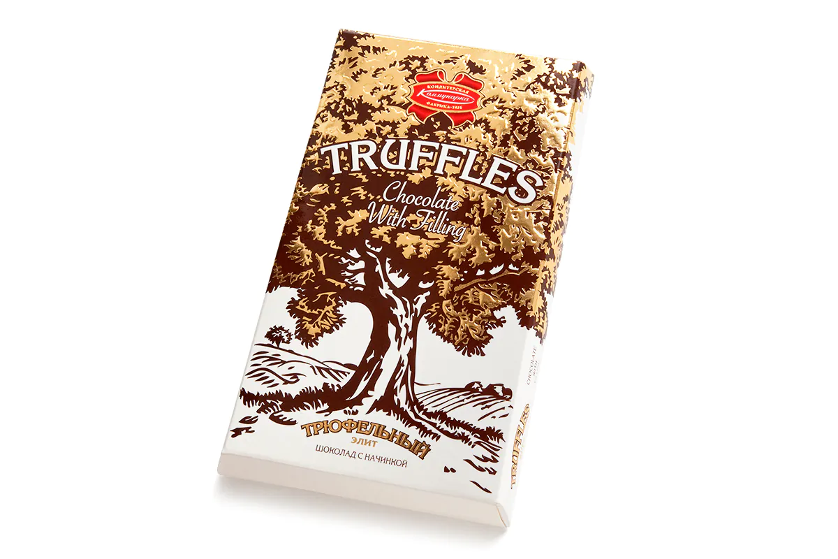
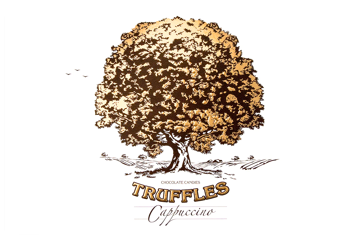
We created a stylized oak illustration in an engraving-inspired graphic style. Its golden crown shines against the warm chocolate background, highlighting the refined taste and value of the product. White accents balance the composition and add a modern, light look.
This graphic element became part of the brand’s visual identity and the core of its confectionery branding
Logo and brand identity
The “Truffles” logo was developed with clean typography, designed to work equally well in Cyrillic and Latin scripts. This universal approach preserved brand identity in the local market and in exports, reinforcing a cohesive brand visual identity.
The packaging design and logo together created a holistic brand style that elevated the perception of this premium confectionery line.
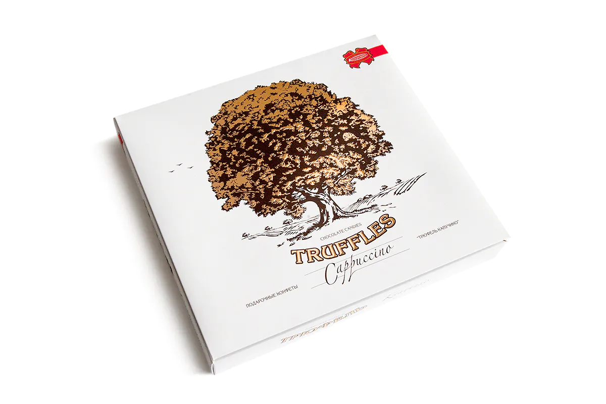
Unified style for candies and chocolate
The packaging design was scaled across different formats: gift boxes of “Truffles” candies and “Truffles Elite” chocolate bars – dark chocolate with a delicate truffle filling and a subtle hint of vanilla.
Such a branding approach ensures consistency across the entire confectionery line, making it more recognizable on the shelf and competitive in the market.
When packaging tells a story
This project shows how packaging and label design can transform a product into a brand story. The oak illustration became more than decoration – it turned into an emotional symbol of premium quality. Combined with golden embossing and a chocolate palette, the “Truffles” packaging stands out on the shelf and creates a sense of a special choice.
The project was recognized by the professional community and shortlisted at the “White Square” Festival 2010 in the “Label and Packaging” category.