MORE FISH is a seafood restaurant, gastronomy, and shop under one roof. The client came with a request for a bold and cohesive brand: a name, a visual mark, and an identity system that would work equally well on the facade, in the interior, and on takeaway packaging.
The Sea Fish group has long been importing fresh and chilled fish. At their venue, guests can choose a fish, have it cleaned, grilled, and packed to take home. But strong positioning required more than just high-quality products: the business needed a brand that inspires trust and conveys freshness and a maritime atmosphere.
Naming: double meaning
We explored dozens of naming options in Russian, Belarusian, and English. The final choice was the short and universal MORE FISH. In English it literally means “more fish,” while for Russian-speaking guests it also resonates as “sea of fish.” This layered meaning gave the brand friendliness, memorability, and a natural communication tool.
Logo and Symbol
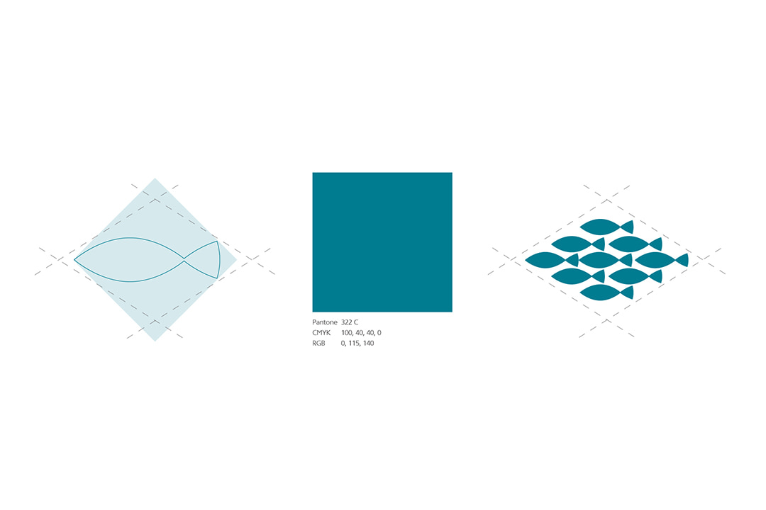
At the core of the logo is a school of fish, arranged into a clean geometric mark. It directly reflects the seafood theme, is easily recognizable, and scales seamlessly—from a facade sign to menus and packaging.
The wordmark balances light “MORE” with solid “FISH,” creating both clarity and confidence.
Color and Typography
The primary brand color is a deep teal, evoking freshness and the sea. Paired with simple geometric forms, it creates a clear and consistent visual code. Typography is minimal and straightforward, keeping the focus on readability and the strength of the logotype.
Interior Identity
We extended the graphic language into the interior. Teal lines and the fish-shoal symbol create a sense of “underwater depth” while also helping with wayfinding. Natural materials such as wood and stone emphasize freshness and authenticity, making the interior a natural continuation of the brand identity.
Outcome: identity that works for the brand
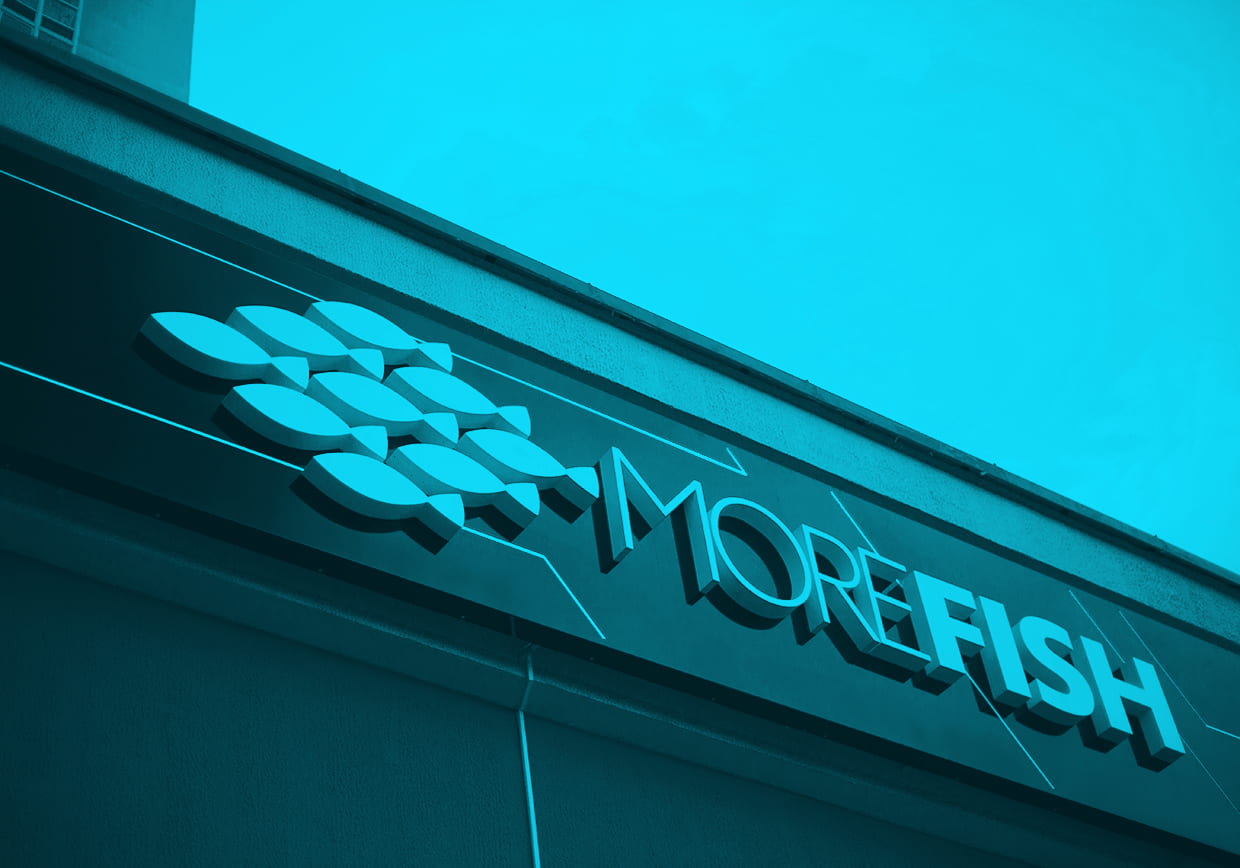
The visual system of MORE FISH became a practical tool for the business. The logo and mark scale effortlessly—from a bold facade sign to takeaway packaging. Interior graphics set the tone of freshness and a maritime atmosphere, while the color palette makes the brand instantly recognizable.
The name MORE FISH became the core of communication. It’s short, memorable, and friendly—inviting guests to come “for more fish” while also promising “a sea of flavors.” This double meaning gave the brand a strong and emotional hook.
The identity not only highlights the gastronomic nature of the venue but also builds trust: guests see a clear visual code, which they associate with freshness and quality. For the company, it means stronger recognition and a deeper connection with the audience.
MORE FISH is an example of how well-thought-out brand identity transforms a restaurant into a cohesive brand with character, atmosphere, and a confident future.
