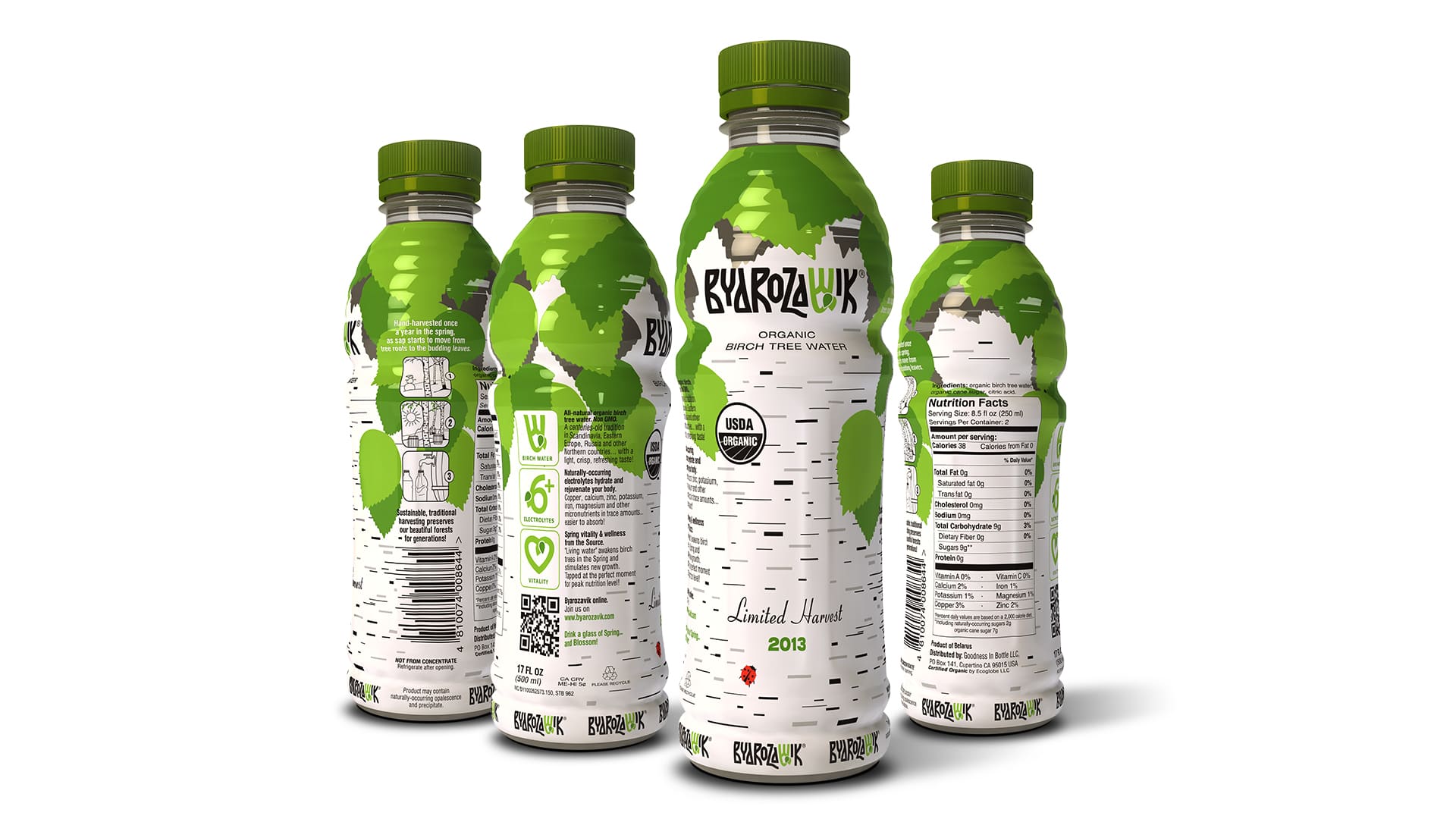
When we started working on BYAROZAVIK, our goal was to reflect the purity and authenticity of natural birch sap. That’s how the key idea was born — turning the bottle into the symbol of a birch tree itself.
The white background with distinctive bark patterns and green leaves created a recognizable and fresh look. This simple yet striking solution became the brand’s visual code.
The project was recognized by the professional community, winning first place in the “Label & Packaging” category at the AD.NAK Festival 2011.
Naming and Logo
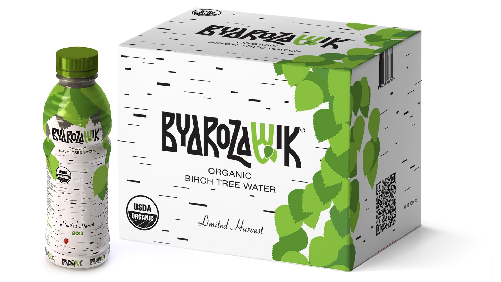
The name “BYAROZAVIK” in Belarusian literally means “birch sap.” We kept the authentic form while adapting it into Latin script, making the brand accessible internationally.
The logo was inspired by ancient symbols: a stylized “small jus” from old Cyrillic and Glagolitic alphabets, which in Latin transforms into the letter V.
Green leaves in the design highlighted associations with ecology, freshness, and nature.
Packaging: the idea of a “living birch”
Our creative breakthrough was designing the bottle so that it resembled a birch trunk. The clean white background, graphic lines, and green details convey spring, freshness, and purity.
We built the design around three values:
- Tradition — sap collected using old methods,
- Eco-friendliness — careful respect for nature,
- Purity — no preservatives or additives.
This packaging not only stands out on the shelf but also tells the product’s story without words.
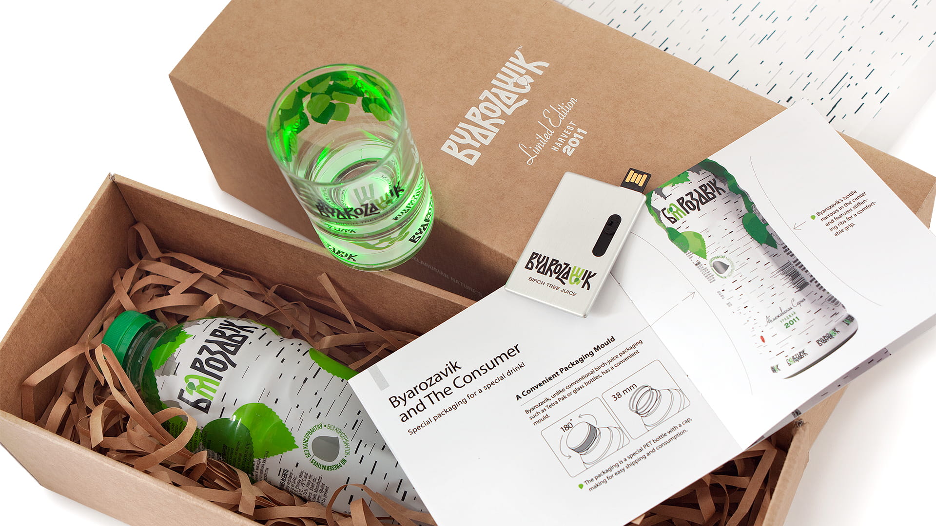
Presentation set
for international partners
Later, we developed a limited presentation set for BYAROZAVIK. Its concept was to emphasize naturalness through the choice of materials.
The box was made of plain corrugated cardboard, with minimal printing and no excess plastic. Inside were a birch sap bottle, a glowing glass, a paper stand, an info booklet, and a USB drive with a presentation.
Only a few dozen of these sets were produced, each becoming a unique “business card” for the brand abroad.

BYAROZAVIK — a brand and packaging
built on authenticity
The BYAROZAVIK project demonstrates how a simple natural metaphor can grow into a strong visual identity.
Naming, logo, and packaging form a unified system that reflects the product’s origin, its eco-friendliness, and its purity.
Results for the brand: BYAROZAVIK birch sap quickly became a recognized and popular product. The first batches were produced with added sugar, but later the company introduced an annual limited edition of 100% natural, sugar-free birch sap.
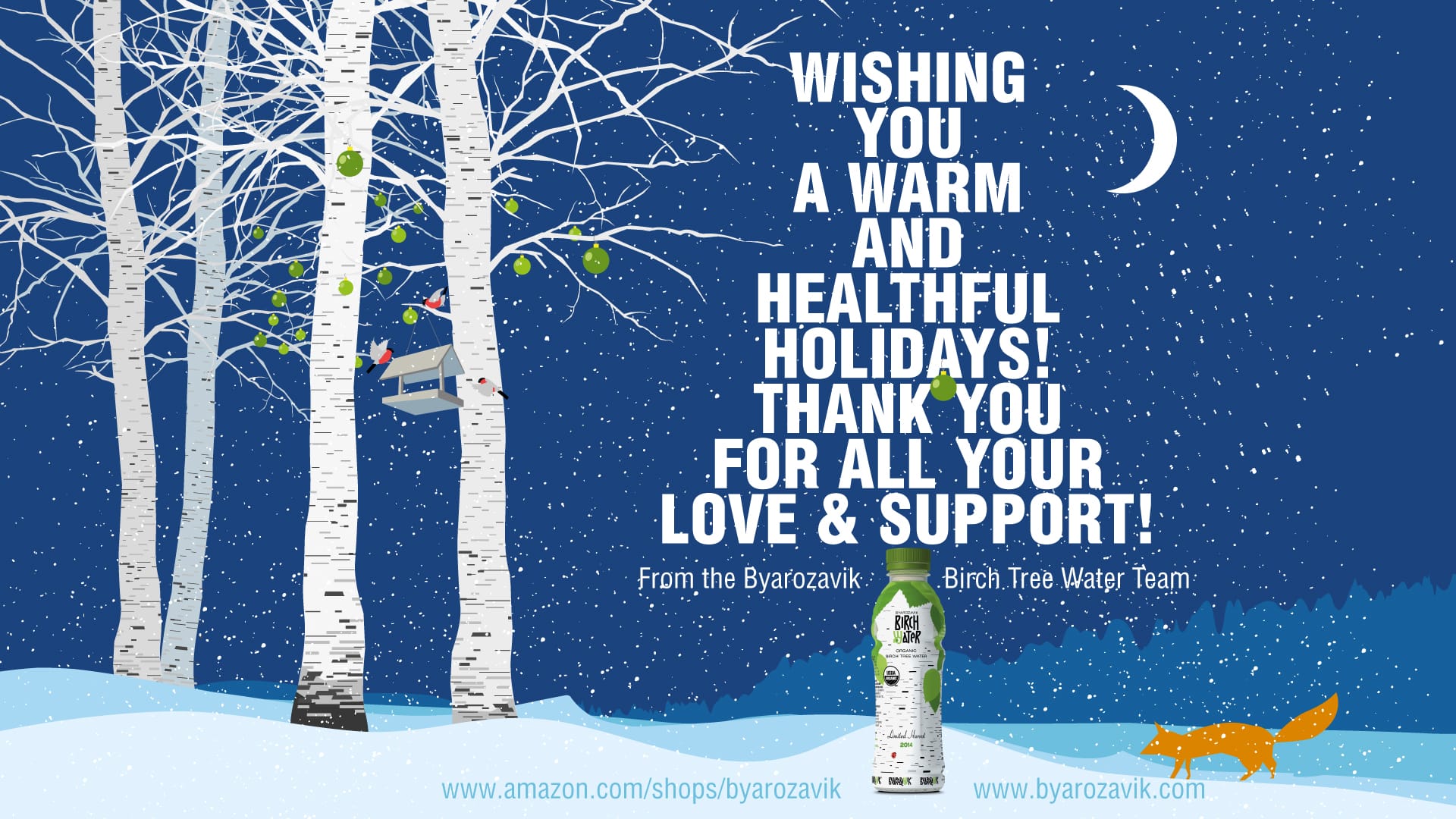
The brand gained popularity not only in Belarus but also in Russia and Kazakhstan. In addition, a special edition was created for the U.S. market and sold on Amazon, where the unique packaging and branding helped the product stand out among other wellness drinks.
As a result, BYAROZAVIK became internationally recognizable, with its authentic branding turning into a strong competitive advantage.