ByFly became one of the most large-scale projects where our studio applied the full spectrum of branding tools – from naming to multimedia campaigns. For Beltelecom, we developed a new high-speed internet brand that was meant not only to introduce ADSL technology but also to become a recognizable symbol of fast and easy connectivity.
Naming – a brand name that is easy to remember
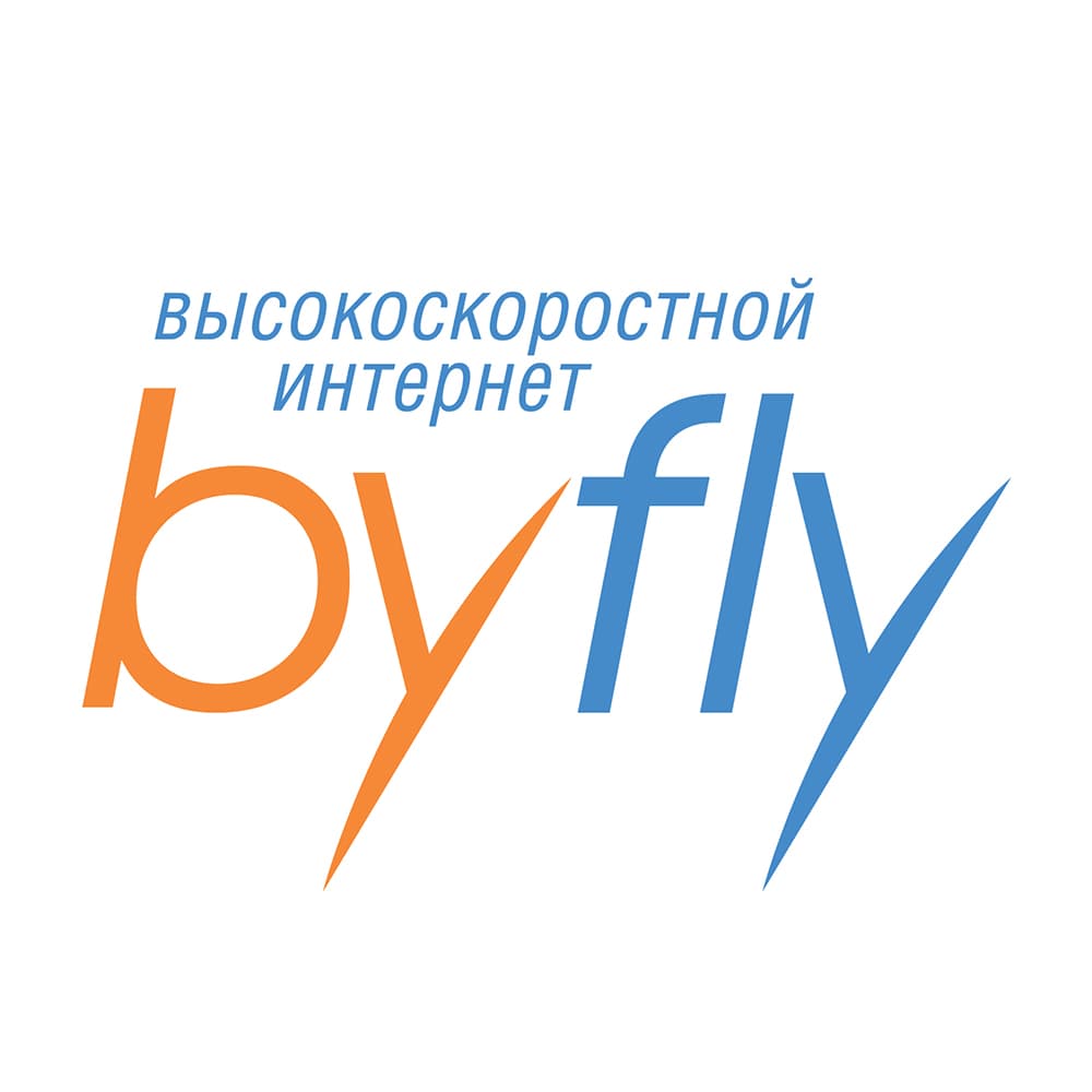
The name ByFly was born at the intersection of rationality and emotion. “BY” refers to Belarus and the national domain, while “Fly” stands for speed, movement and freedom. Together, they form a light and dynamic word that instantly communicates the essence of the service: unlimited and effortless internet access.
Logo and visual style setting the tone of communication
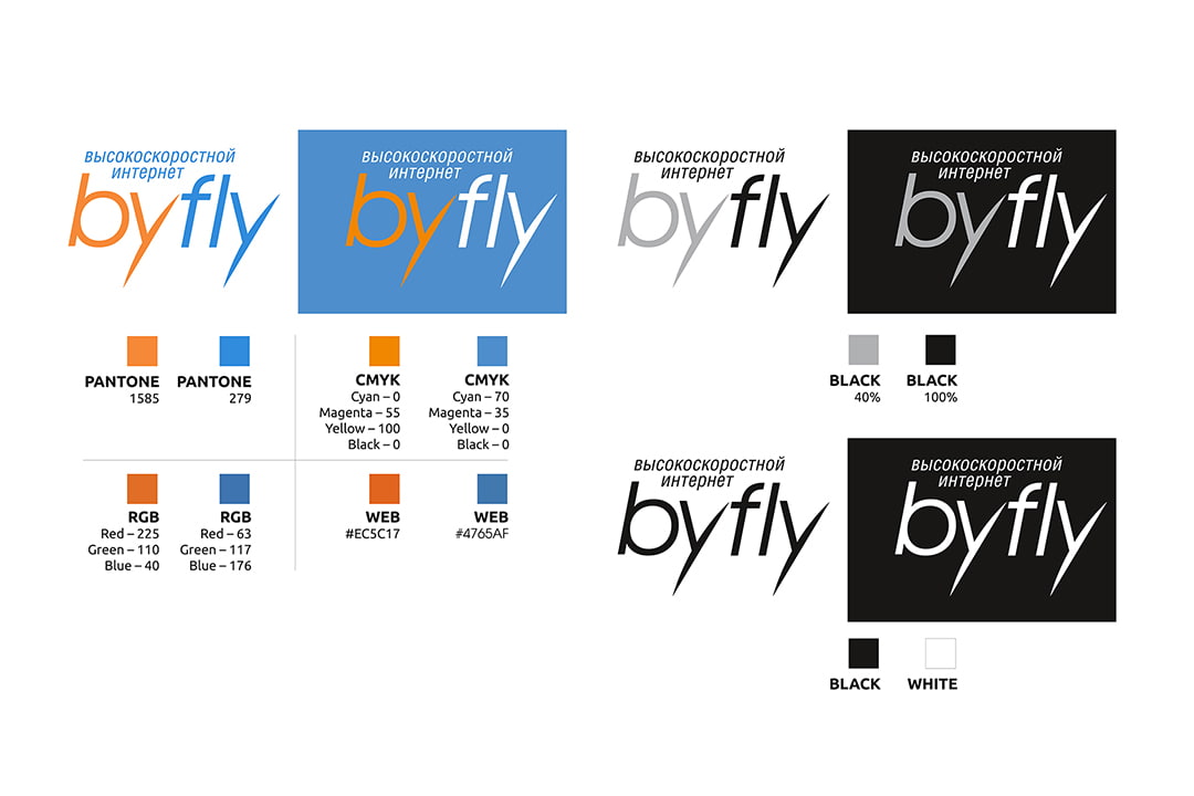
We designed a logo built on the energetic contrast of orange and blue. Orange reflects trust and energy, while blue conveys technology and lightness. This visual code became the foundation of the identity system. We developed a complete set of graphic elements, typography and color solutions, adaptable across all media – from business cards to city billboards.
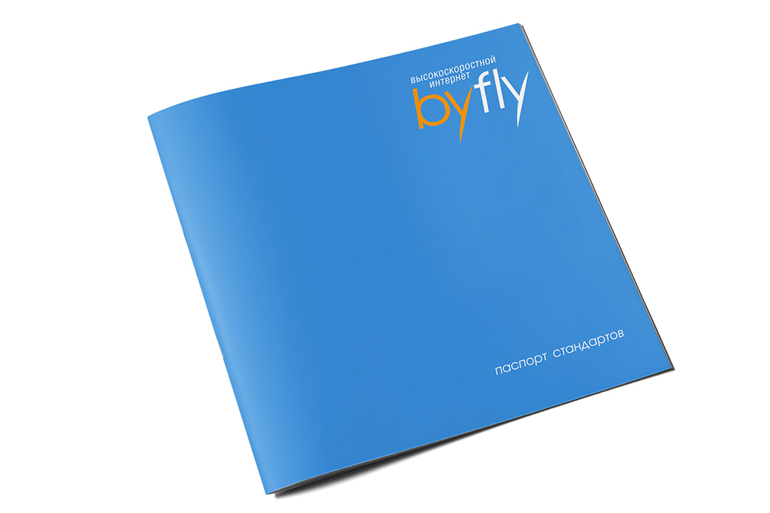

Brandbook and design standards for consistent growth
To ensure brand consistency across all stages, we created a detailed brandbook. It outlined key guidelines: logo usage, color palette, typography, layout grids and graphic patterns. This tool allowed Beltelecom to scale the brand quickly while staying coherent across every communication channel.
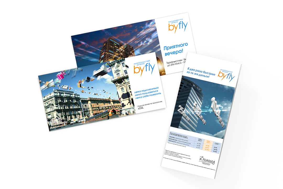
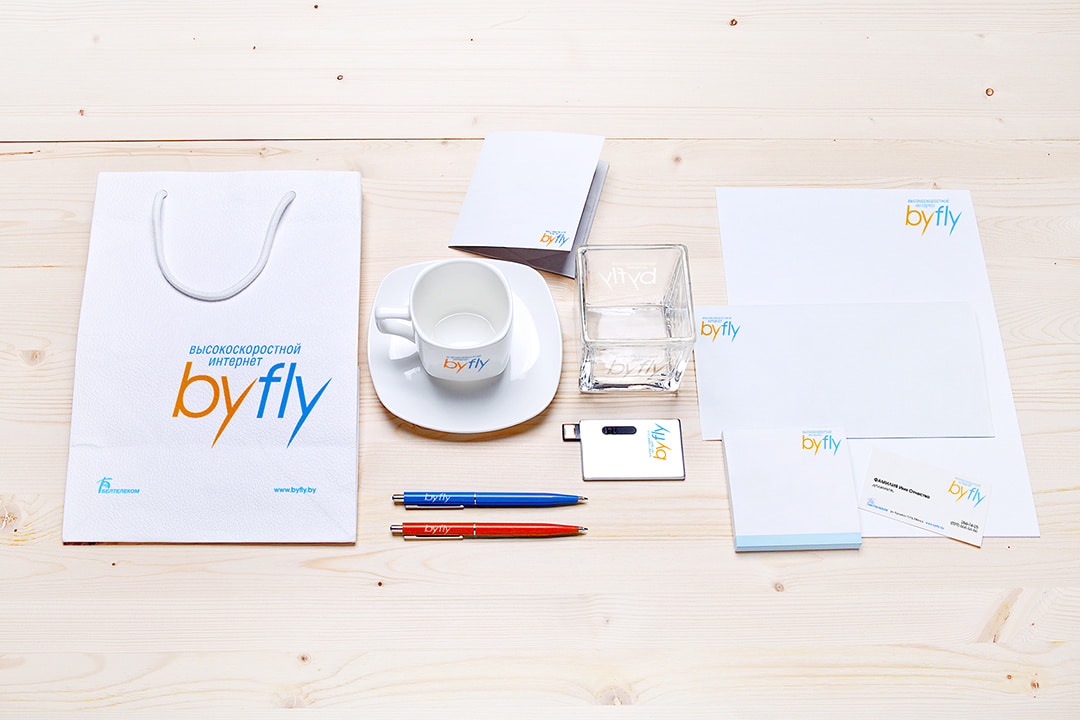
Print design and advertising in the urban environment
The ByFly identity came to life in numerous touchpoints. We designed brochures, flyers, POS materials and merchandise, as well as bold billboard campaigns for outdoor media. Every asset reinforced the brand promise: internet that is always close and always fast.
Video production as part of branding
The brand extended beyond print communication. We produced a series of promotional videos combining live action, 3D graphics and infographics. These films highlighted the technical advantages of the service in a simple, engaging way and helped build emotional connection with the audience.
How comprehensive branding turned ByFly into a symbol of speed
ByFly is a strong example of how integrated branding creates a powerful image. Naming, logo, visual identity, print materials, billboards and videos came together into a consistent system that enabled Beltelecom to launch a brand quickly recognized and trusted by customers. Today, ByFly continues to be associated with effortless connectivity and high-speed internet, while its visual identity remains modern and recognizable.
A holistic approach to building a brand
The ByFly project brought together several areas of our expertise:
- Branding and visual identity
- Print design
- Video production and presentation films
This multifaceted approach allowed us to create a coherent brand image and support its presence across all communication levels – from the first impression to recognizable advertising campaigns.