This project was carried out for the Pruzhany Canning Factory, which was preparing to launch a new product line under a fresh brand. Our task was to create packaging and a visual identity that would immediately communicate the idea of a simple, trustworthy product and help it stand out on the shelf.
The scope included:
- developing the naming,
- designing the logo,
- creating packaging and label design for the full product line.
Naming
The brand name became the starting point for the entire identity. After exploring several options, we chose “Bez E”(translated as “Without E”).
It worked perfectly because it is:
- short and memorable,
- instantly communicates the main idea — no “E” additives,
- functions both as a brand name and as a slogan.
This directness set the right tone for all communication: straightforward, clear, and trustworthy.
Logo design
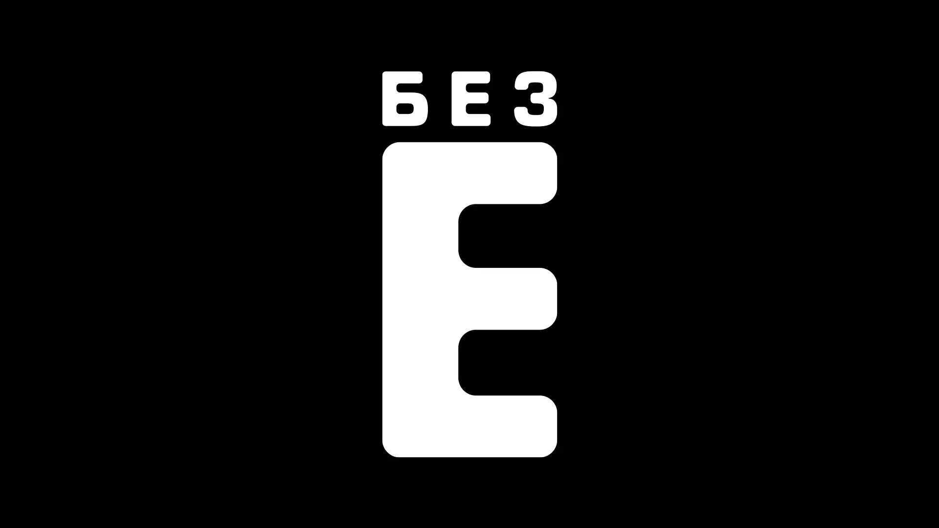
The next step was the logo. We took a minimalist approach, placing the bold letter “E” at the center to play visually with the word “Bez.”
Such a logo:
- is instantly recognizable,
- remains legible across any medium,
- works equally well on packaging and in digital use.
Its simplicity and clarity gave the brand a confident, modern look.
Packaging and label design
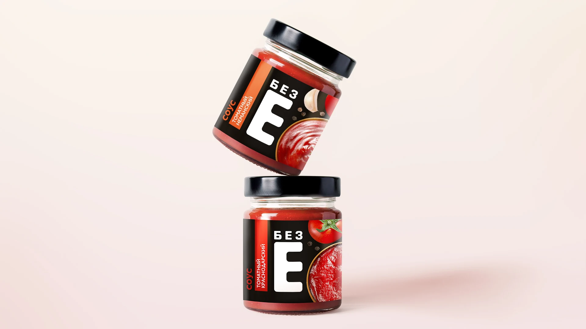
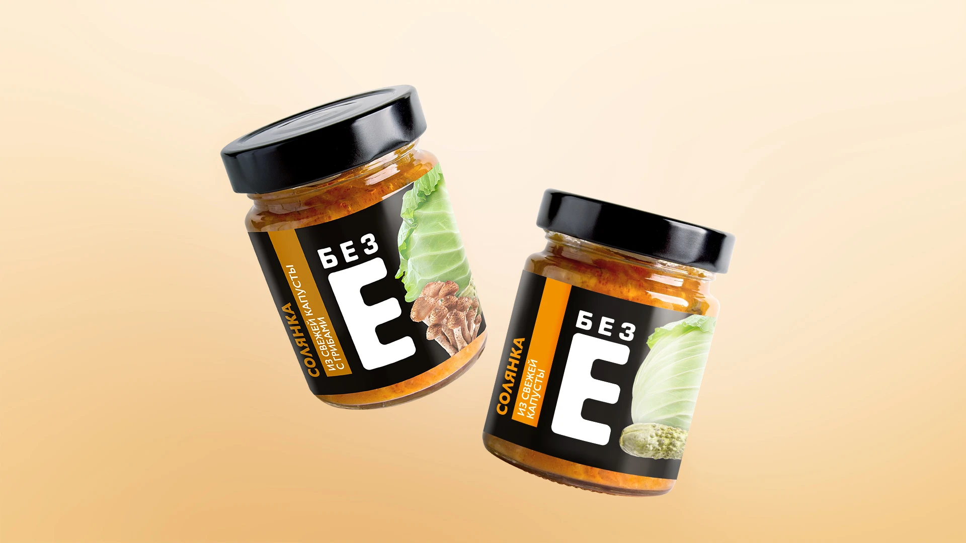
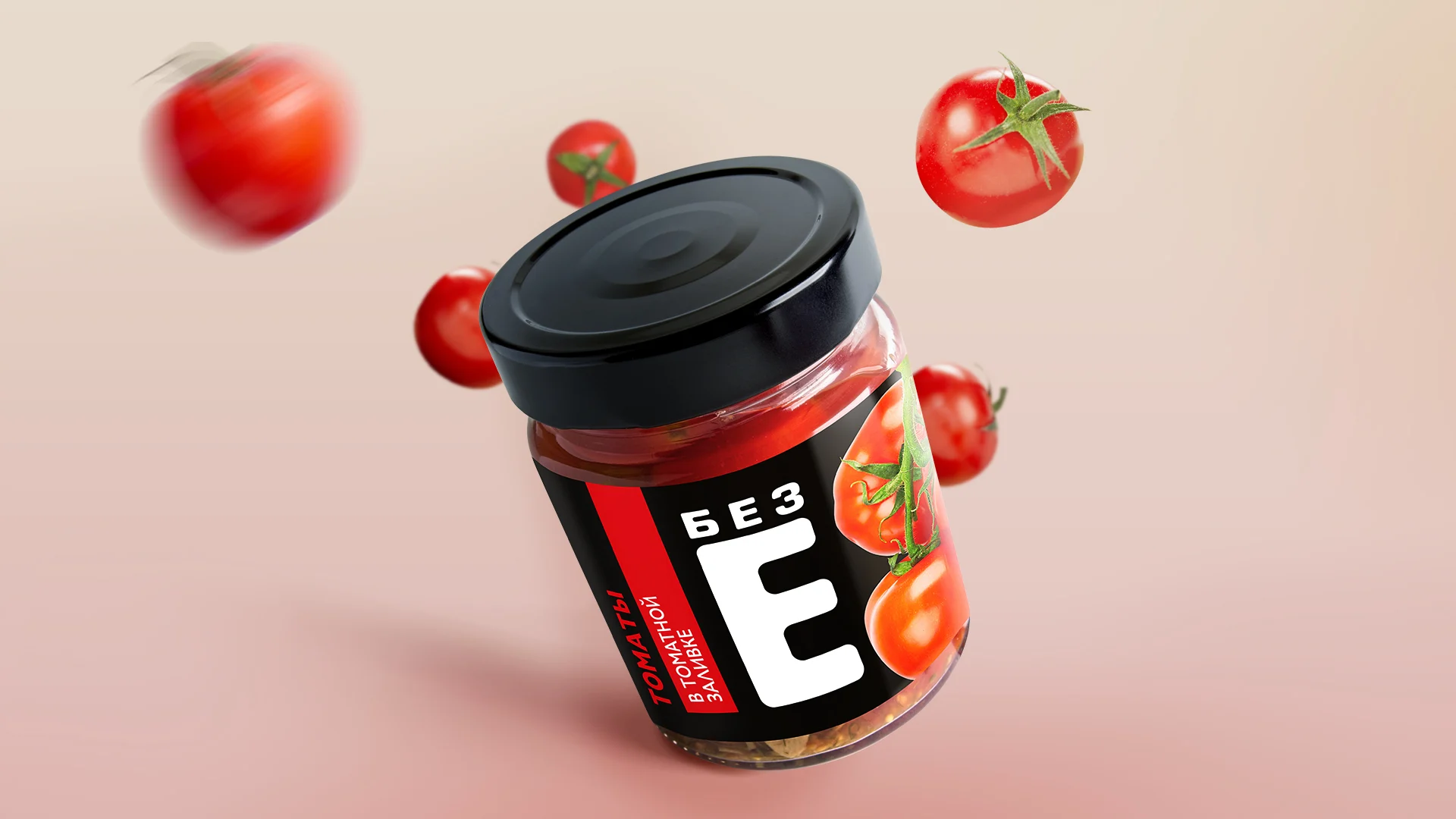
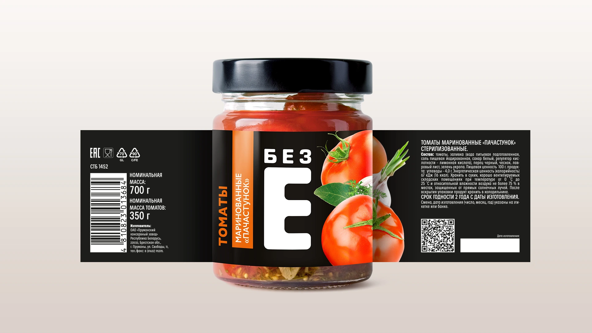
Labels are the brand’s first point of contact with the consumer. Our goal was to make them clean and easy to read, but also eye-catching.
Key design principles:
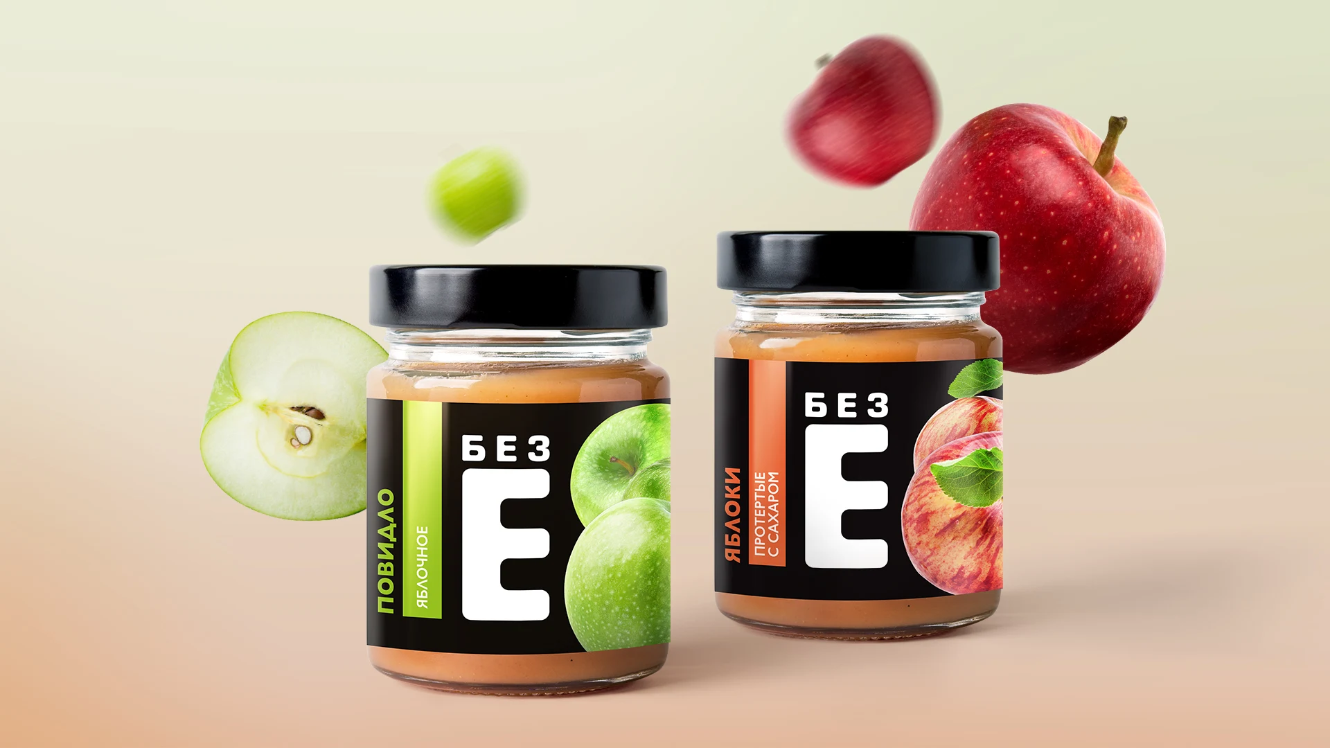
- the brand name placed prominently at the center,
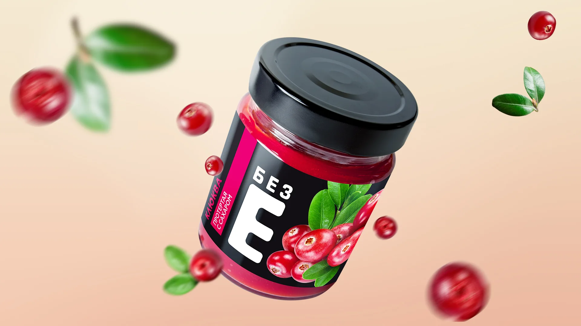
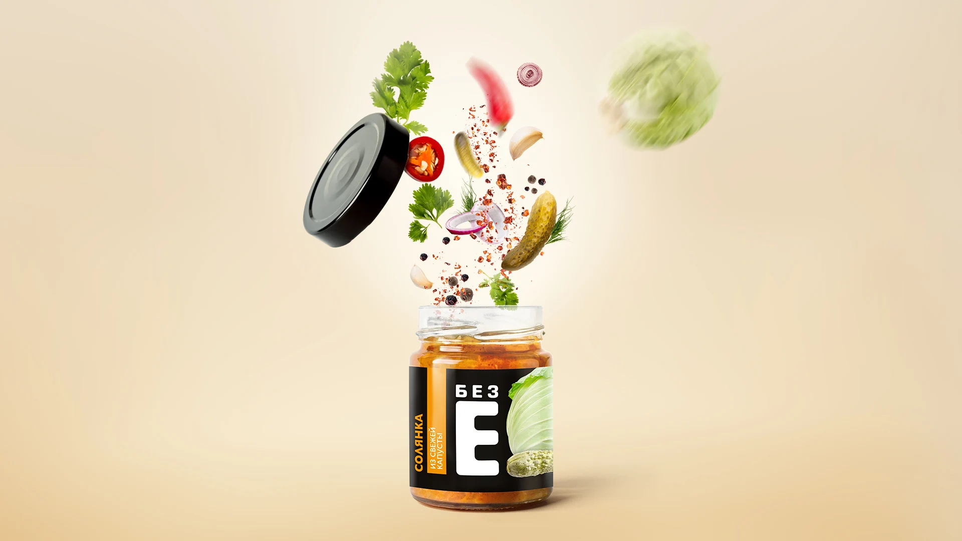
- appetizing photography of ingredients,
- a light, minimalist layout without clutter,
- a unified template applied across the line.
To differentiate categories, we introduced a color system:
- red accents for tomatoes and sauces,
- green for apple products,
- warm orange and yellow for vegetable mixes,
- deep berry shades for fruit and berry products.
This made the range consistent yet allowed each product to keep its individuality.
Brand visual identity
The “Bez E” project went beyond labels — we built a complete visual identity system that works across every channel:
- on the shelf, ensuring visibility,
- in digital and advertising campaigns,
- through branded style elements in communication.
The outcome is more than just packaging design — it’s a trust-building identity:
- a name that speaks for itself,
- a logo that strengthens recognition,
- labels that make product choice simple and clear.
As a result, “Bez E” secured its place in a competitive market and became associated with transparency and honest food.
