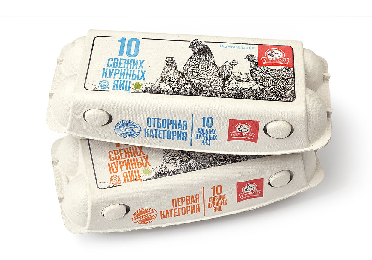
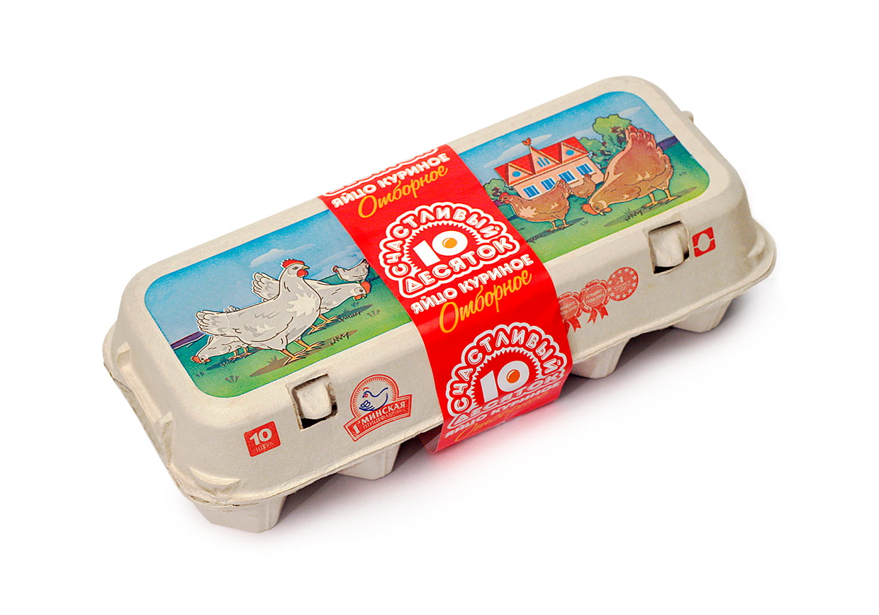
Unified style and eco-friendly printing
This project was part of a broader collaboration on packaging and label design and food branding. The 1st Minsk Poultry Factory introduced eco-friendly cartons with direct printing, which set the tone for the entire concept.
We developed a visual solution with linear illustrations and a pastoral landscape. This approach conveys naturalness and trust, while clean typography and color coding make it easy to distinguish the product lines: blue for “Selected” eggs and orange for “First category.”
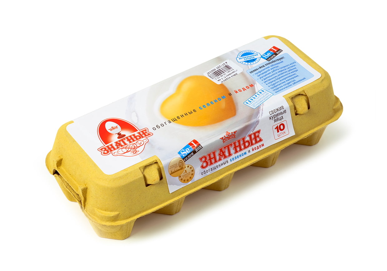
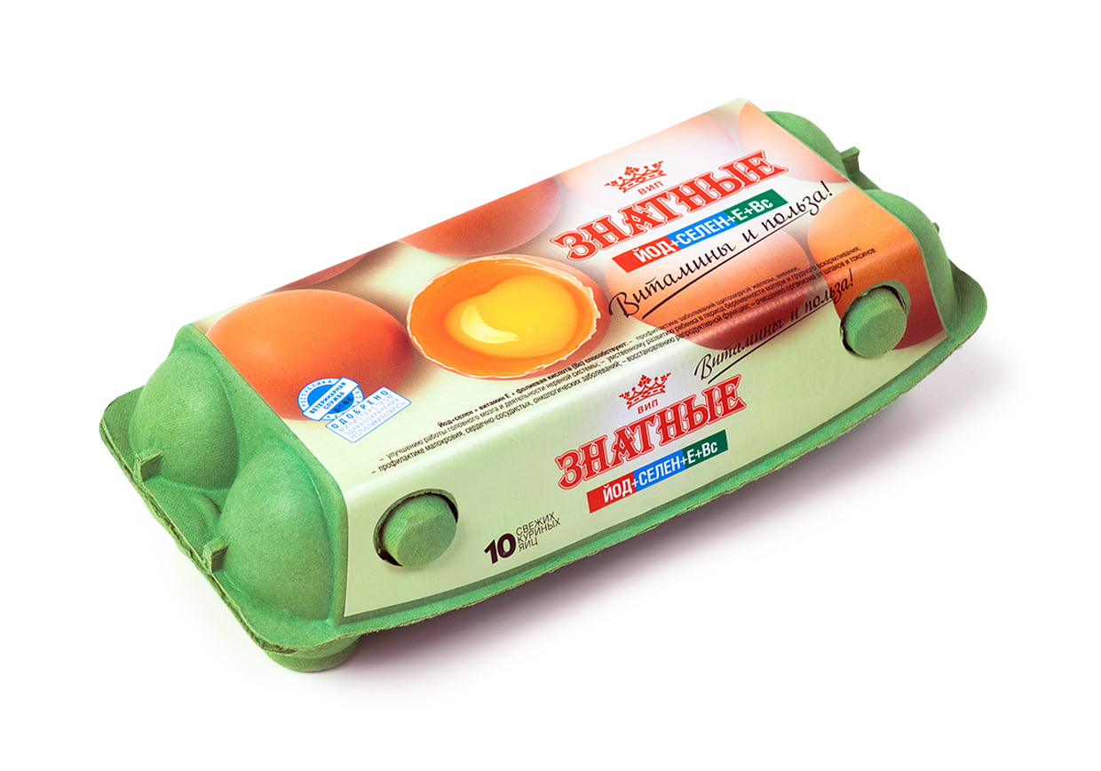
“Znatnye”: nutrition as brand value
For the “Znatnye” line, the design highlighted the product’s health benefits — high levels of selenium, iodine, and vitamins. A yolk in the shape of a heart became the central graphic symbol, visually communicating care for consumer well-being. This shows how packaging design can reinforce brand values and positioning.
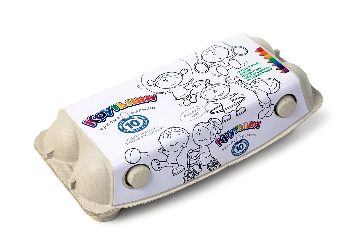
“Krutyshi”: fun for children and parents
The “Krutyshi” line, featuring small eggs from young hens, was aimed at families. We turned the packaging into a coloring-book format with cheerful characters and short rhymes. This interactive approach engaged children and highlighted the brand’s attention to family audiences. It combined graphic design, illustration, and playfulness, making the product more memorable and emotionally engaging.
The role of branding and packaging design in FMCG
We created a unified visual system for several lines, based on eco-friendly solutions, a clear graphic language, and creative concepts. This case illustrates how a thoughtful approach to branding and packaging design helps companies stand out in the FMCG category and build lasting consumer trust.
The experience gained in this project is applied in other areas as well:
- Branding and visual identity — creating a consistent image for a company or product;
- Packaging and label design — from concept to production-ready layouts;
- Print design — catalogs, brochures, posters, and corporate materials.