Brand Story and Collaboration Idea
J:MORS is a natural fruit drink that refreshes in summer and warms in winter. Its core flavors are based on traditional berries: cranberry, blueberry, and blackcurrant.
The idea of the brand dates back to 2006, when the Belarusian rock band J:MORS and the Minsk Soft Drinks Plant considered a joint project. At that time, the collaboration didn’t happen, but twelve years later it was brought to life. The company approached us with the task of creating packaging design that would highlight the uniqueness of the brand and connect it to music.


Developing the Packaging Design
The work on the final product lasted six months. Together with the band, we tasted 15 drink variations before selecting the three main flavors. After that, we moved on to the label design.
The main goal was to convey the band’s energy while emphasizing the natural origin of the drink. The packaging needed to stand out on the shelf and be easy to recognize.
Visual Concept and Graphics
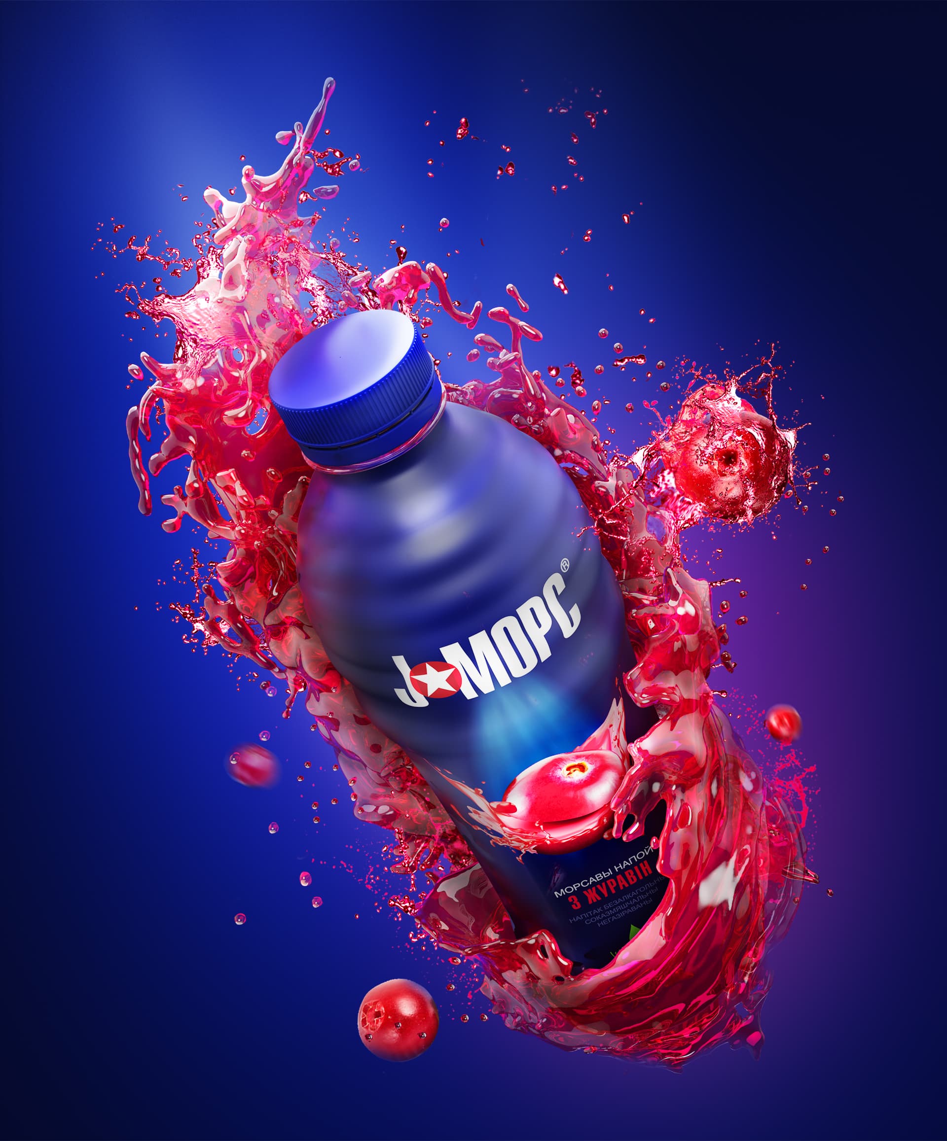
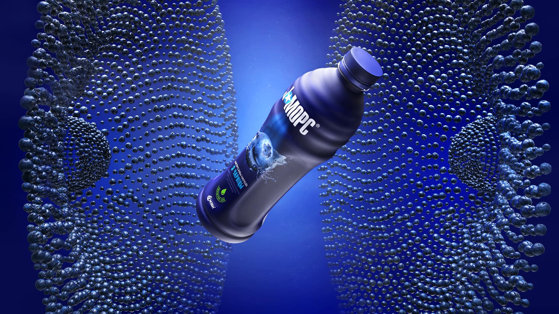
The design concept was inspired by the atmosphere of a live concert — stage lights, drive, and emotions. The matte dark-blue background of the label symbolizes the venue, while the rays from the logo resemble spotlights highlighting the “soloist” — a bright berry with splashes around it.
To enhance the effect, we combined matte and glossy varnish, adding depth and dynamics. The central text is in Belarusian, with additional information duplicated in Russian.
Packaging that Brings Music and Flavor Together
The J:MORS packaging became a reflection of the brand’s essence: the drive of music and the freshness of natural berries in one visual image. This approach helped the drink stand out on the shelf and instantly evoke the right associations with the product.