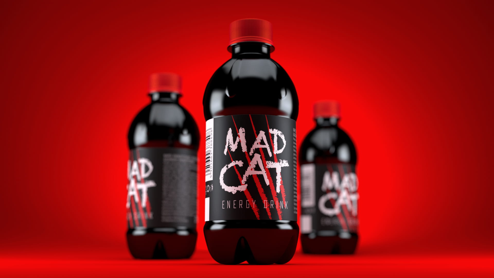
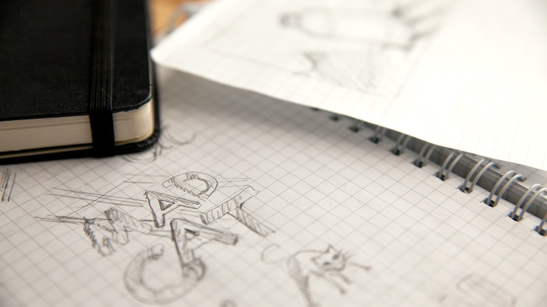
The name MAD CAT instantly sets the tone — bold, energetic, and a little wild. We built on this emotion and created a design that reflects the brand’s character.
Graphics that spark emotions
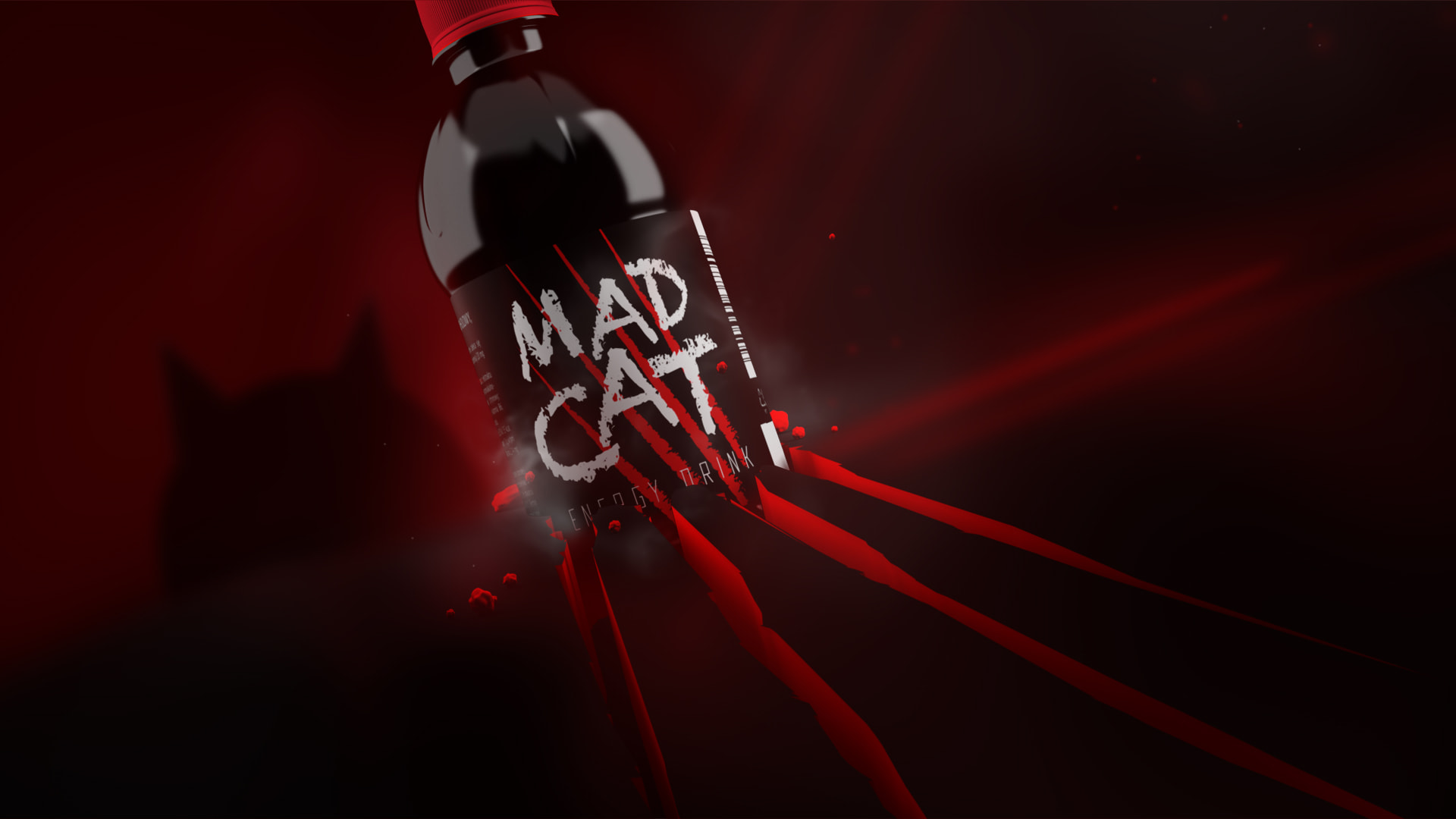
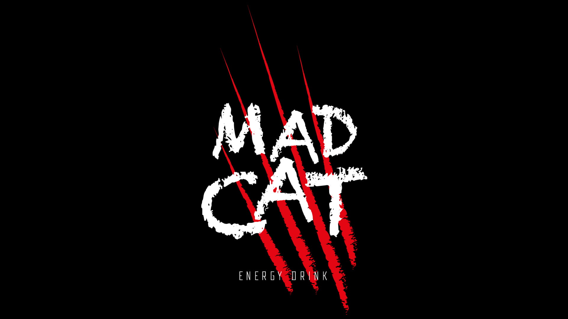
The key element became the stylized claw marks. Bright red strokes create a sense of motion and strength, turning the label into a symbol of the drink’s inner energy.
Brand color and character
We chose black and red — a timeless contrast associated with drive and determination. This visual code enhances the product’s expressiveness and makes it stand out among competitors.
A memorable result
The label turned out bold and dynamic. It immediately grabs attention on the shelf and conveys the brand’s message: be daring in your actions, be a little mad.