“Ya-godny Mors” is a natural berry drink recommended for children of preschool and primary school age. The product is aimed at caring parents who choose high-quality, safe nutrition for their children.
Our task was to create a label design for a ready-made bottle that would:
- stand out on the shelf,
- emphasize natural ingredients,
- speak clearly to the target audience,
- build trust in the brand from the first glance.
Visual identity and logo styling of the product name
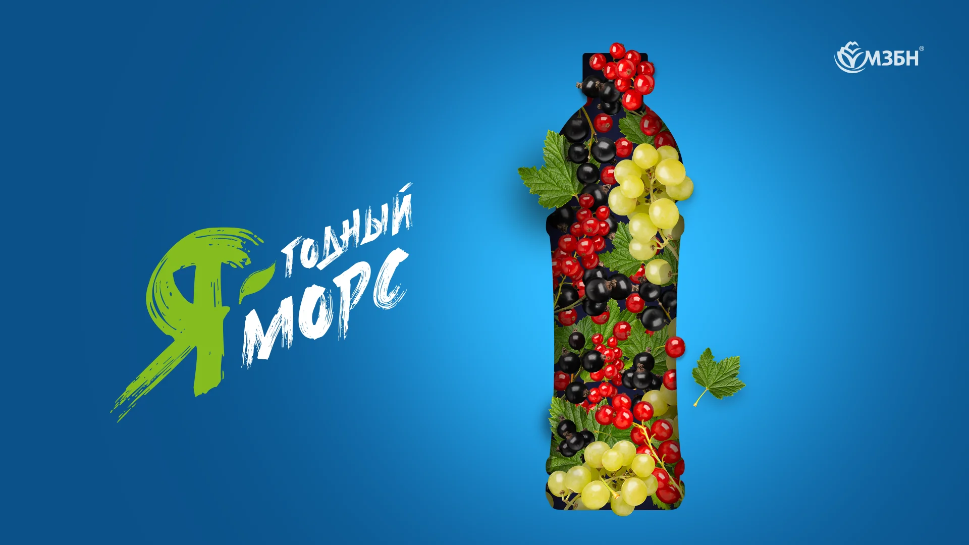
The name “Ya-godny Mors” was created by the marketing team at MZBN. Our role was to transform it into a distinctive visual element and part of the product’s visual identity.
- The word “Я” (Ya) is colored green and styled like a paintbrush stroke, evoking nature and freshness.
- The words “годный” (godny, meaning ‘wholesome’) and “морс” (mors, meaning ‘juice’) are set in white, suggesting purity and honesty.
- The hyphen is replaced with a small green leaf, adding playfulness and a natural feel.
This visual concept turns the name into a memorable graphic element — clean, friendly, and recognizable to both children and adults.
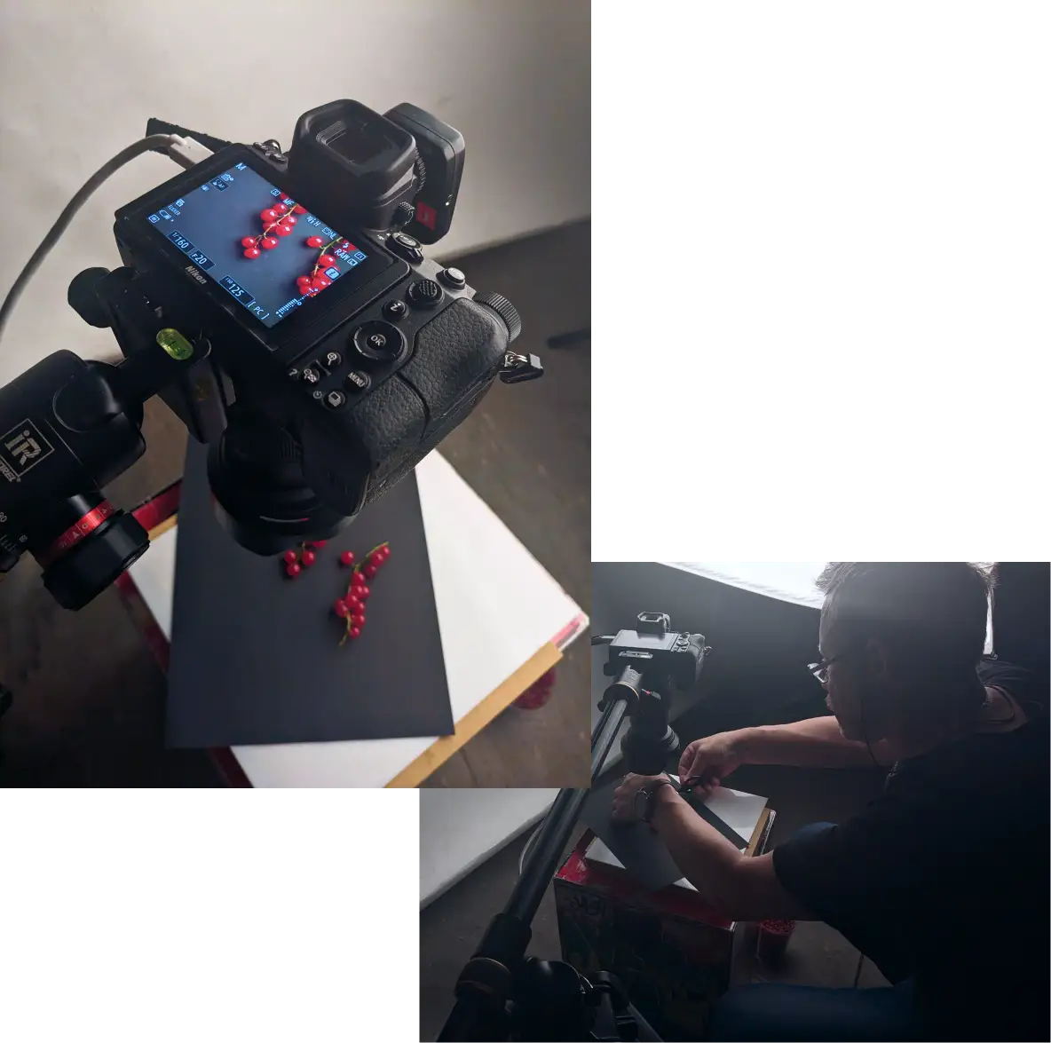
Photoshoot for berry drink identity and label appeal
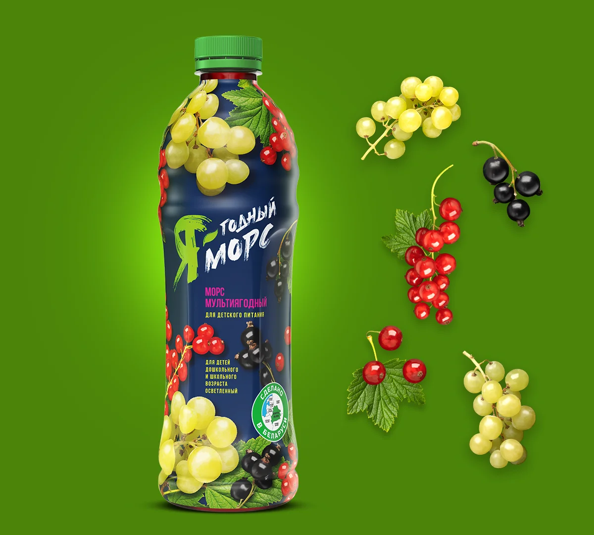
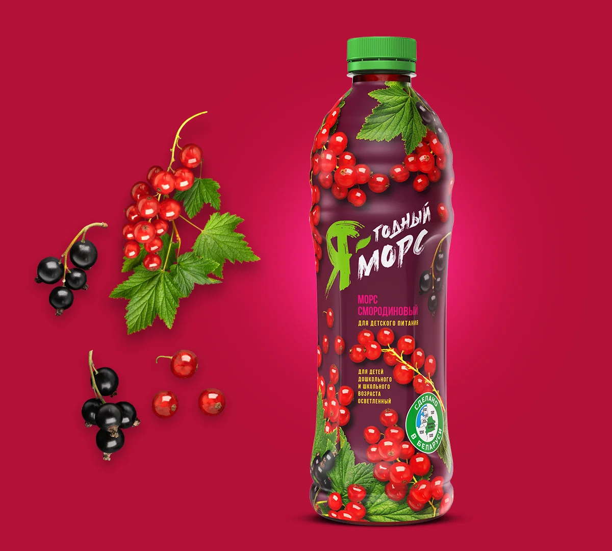
To create the visual language of the packaging, we organized a product photoshoot using fresh berries. These real images became key visual elements:
- They add authenticity and life to the label
- Strengthen taste associations and visual appeal
- Reinforce the product’s natural quality
- The berries wrap around the bottle, forming a dynamic, appetizing, and vivid impression.
This project shows how graphic design can enhance a product’s promise. We developed a label that communicates trust and naturalness from the first glance. Typography, color, imagery, and composition work together to deliver a unified message: this is a juice you can trust to serve your children.