Truffles chocolate
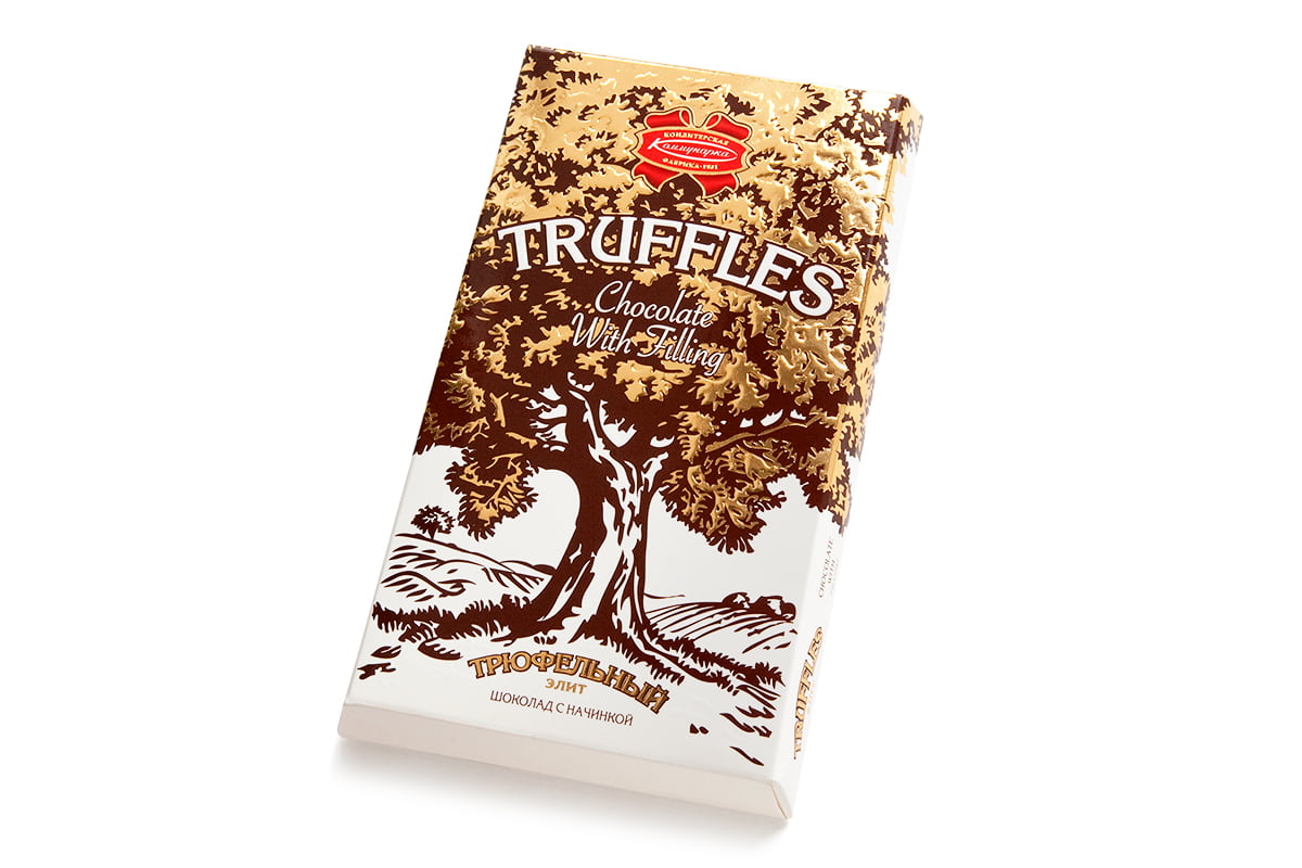
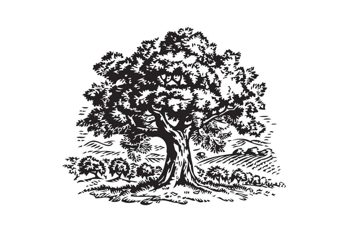
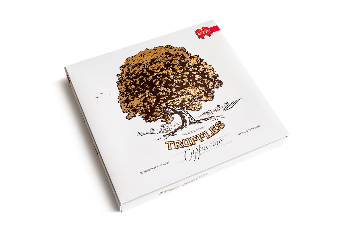
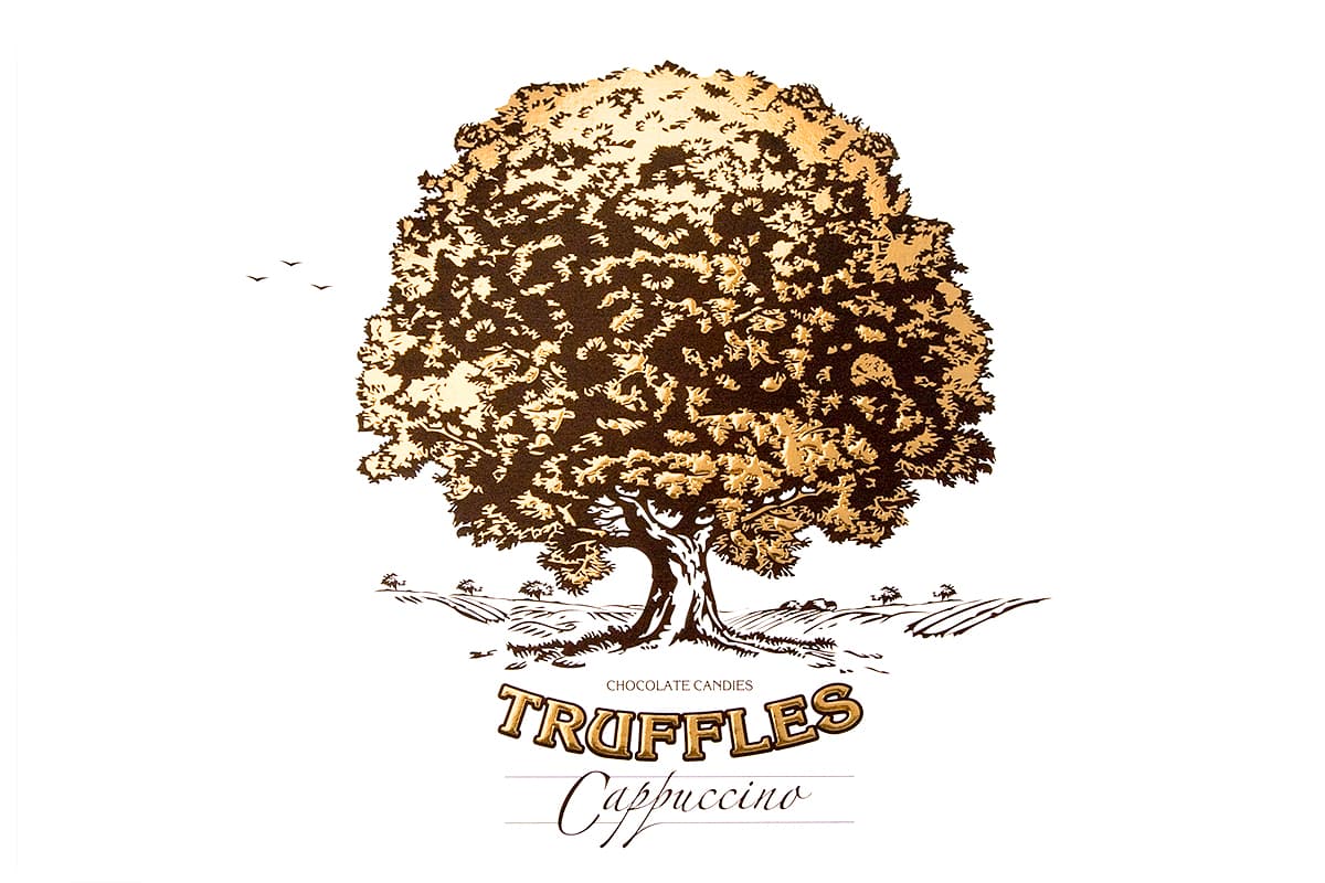
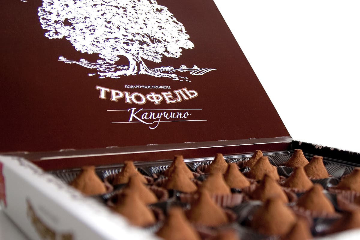
The truffle chocolate packaging was inspired by truffles growing in oak and beech groves. Our team decided to use oak as the main design element, which led to the creation of the candy box.
The packaging design features two primary colors, warm chocolate and gold, which complement each other perfectly. The golden oak is the centerpiece of the graphics and is skillfully used to create a sense of luxury and sophistication.
Using of illustrations gives the packaging a unique and attractive look. Illustrations are also used to emphasize the truffle flavor of the chocolate, which is a benefit of the product.
Our studio created a memorable graphic design for the package of “Truffle” chocolate from the factory “Kommunarka”. The typography is clear and easy to read, allowing customers to easily identify the product on the shelves. The use of white space also helps to create a sense of balance and harmony in the design.
Overall, we created a packaging design that perfectly captures the essence of Truffle Chocolate. Using of oak as the main element in the design is inspiring, and the warm chocolate and gold colors blend perfectly with the product. The illustration and graphic elements are beautiful and functional, allowing customers to easily identify the product and understand its unique benefits. This is a great example of how good packaging design can increase product appeal and help increase sales.
At the festival of advertising “White Square” 2010, the design of the “Truffles” chocolate packaging was included in the short list in the nomination “Label and packaging”.
Сlient:
JV JSC "Kommunarka"
Our services:
brandingillustrationpackaging design