Every year, Coswick sends holiday greetings to its partners around the world with a festive animated video. This time, we created a branded video card in the format of a pop-up book, blending motion design, 3D animation, and the charm of handcrafted paper scenes. Each page of this holiday story comes alive — cities, symbols, architecture, and characters unfold in motion. This animated video greeting became a heartfelt way not just to say “Happy Holidays”, but to convey the brand’s visual aesthetic and celebratory spirit.
The video unfolds as a journey across the globe, with Coswick’s gifts and products traveling to different countries and continents. The symbol of 2024 — an emerald dragon — accompanies and protects the parcels.
We chose the format of a pop-up book: each scene opens like a panoramic paper illustration, creating a sense of presence. Motion design brings rhythm and flow — from the mountains of the East to European city squares.

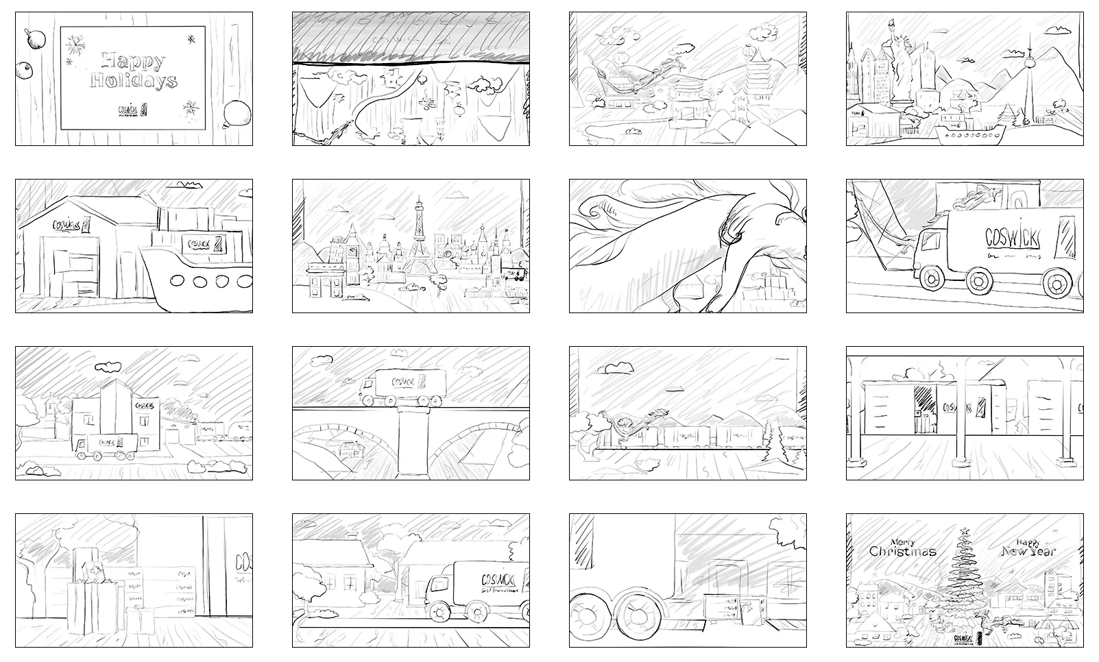
Storyboarding and Pre-Production
Before jumping into animation, we developed a detailed storyboard. Every frame, transition, and visual symbol was carefully considered. This ensured a clear and dynamic narrative, where each moment supports the overall festive story.
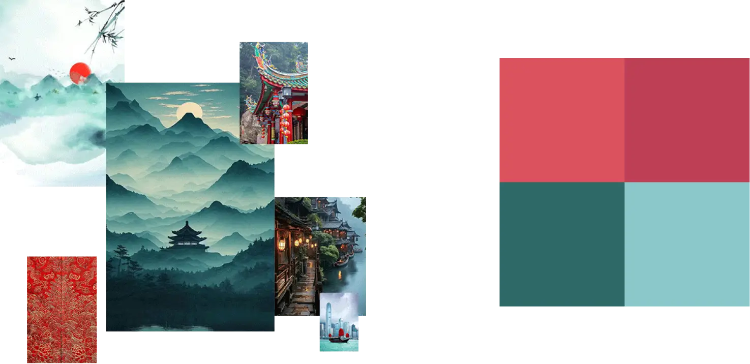
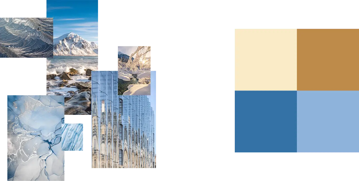
Moodboard and Color Palette
Each scene was matched with a unique color scheme reflecting its setting and emotional tone. Warm reds of the East, icy blues of European winters — all color solutions support the pop-up aesthetic and enhance the mood of the animation.
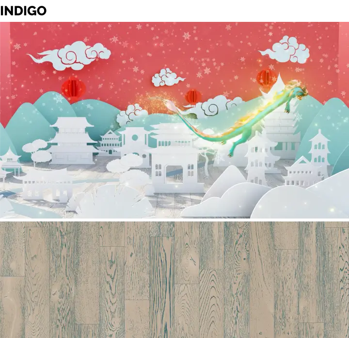
Character of the Year — The Dragon
The central figure in the card is a dragon, the official symbol of 2024. We brought him to life through 3D animation, integrating him seamlessly into the narrative. He moves gracefully through the scenes, guarding the delivery and adding a magical touch to every frame.

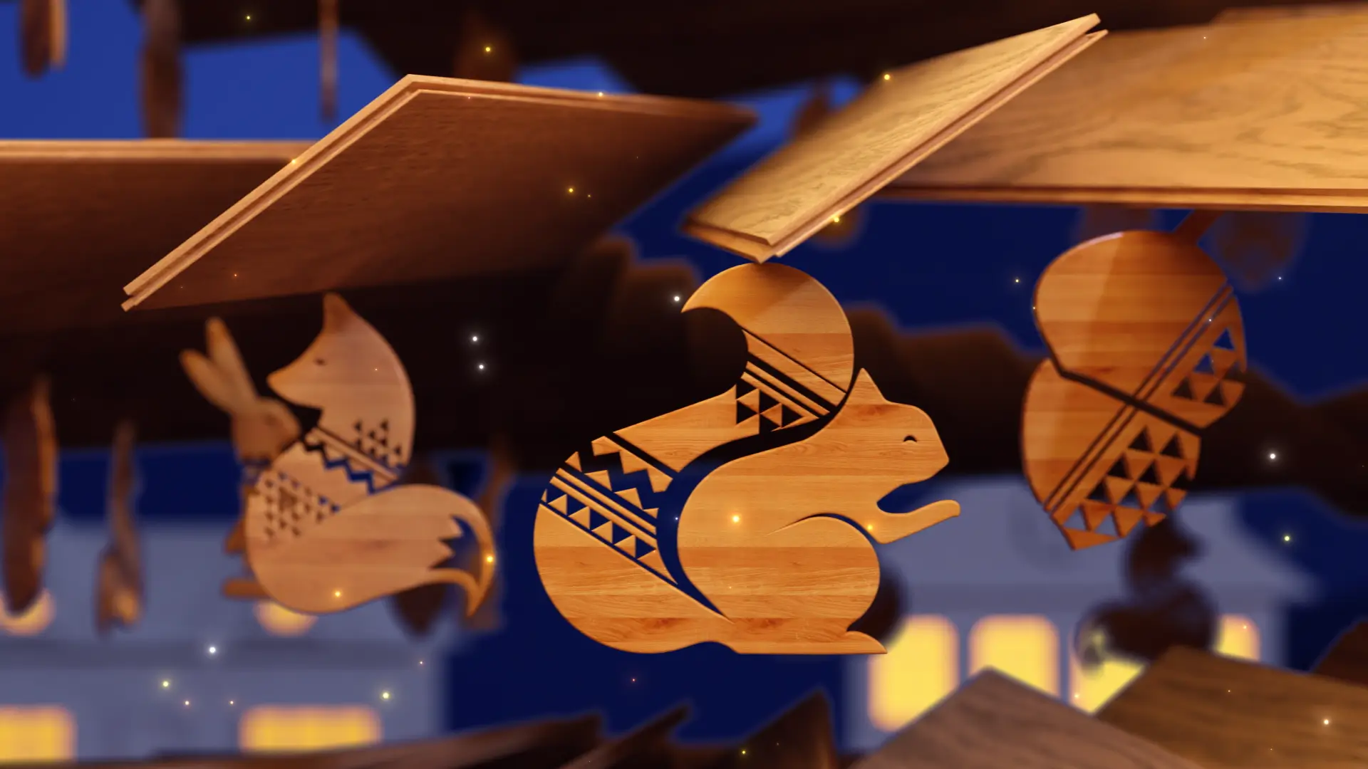
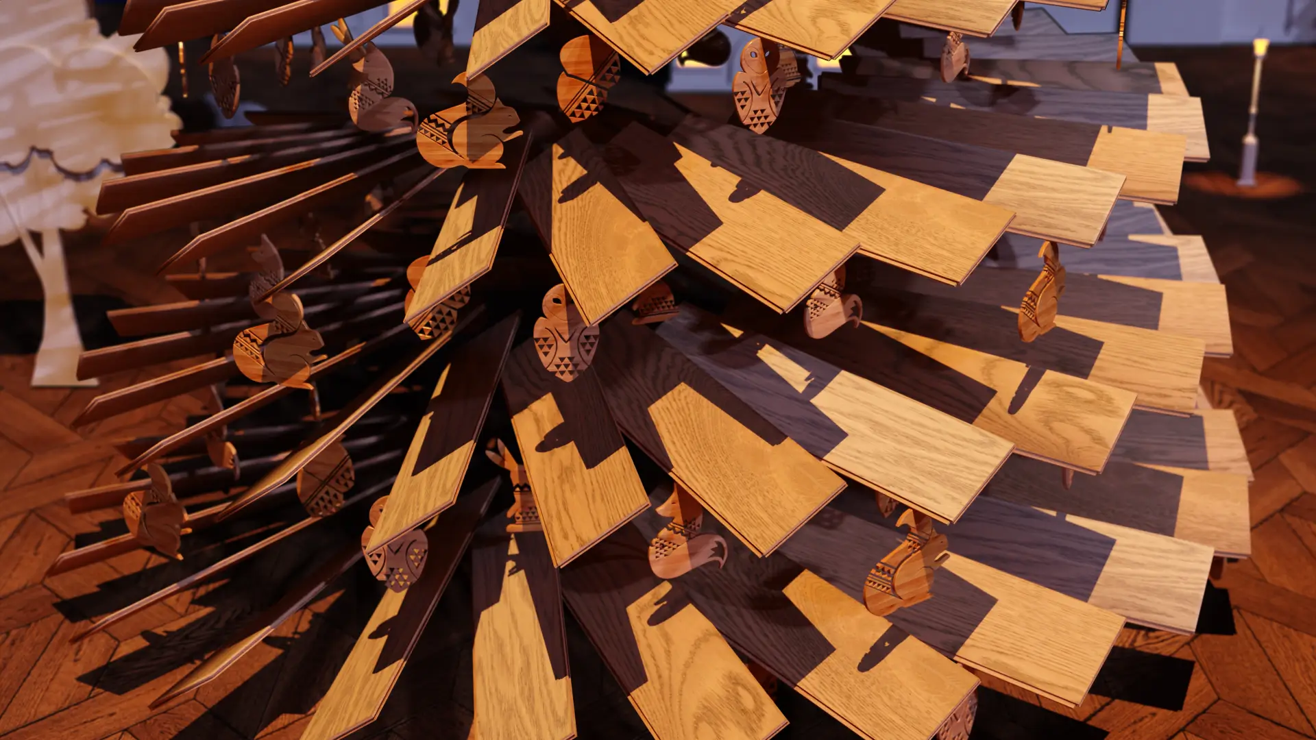
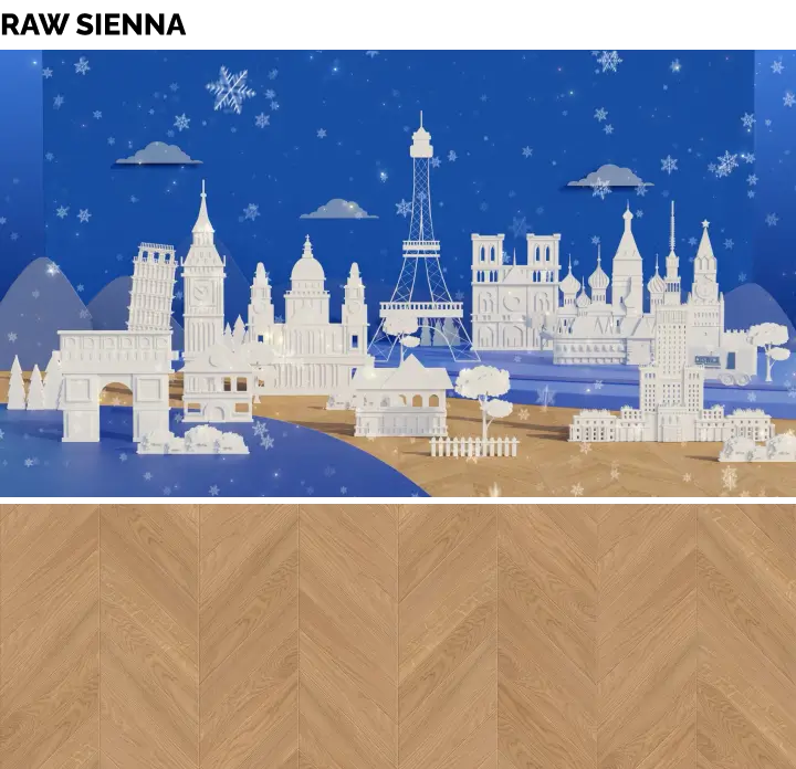
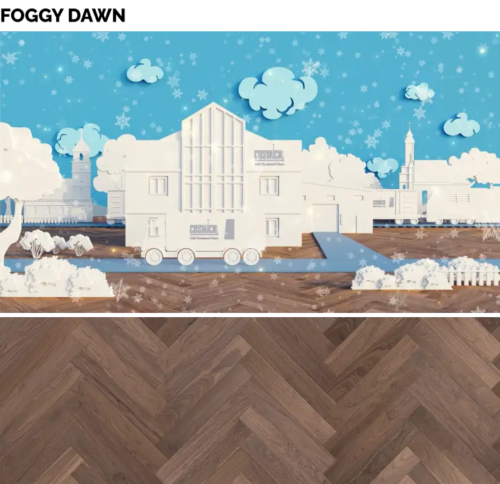
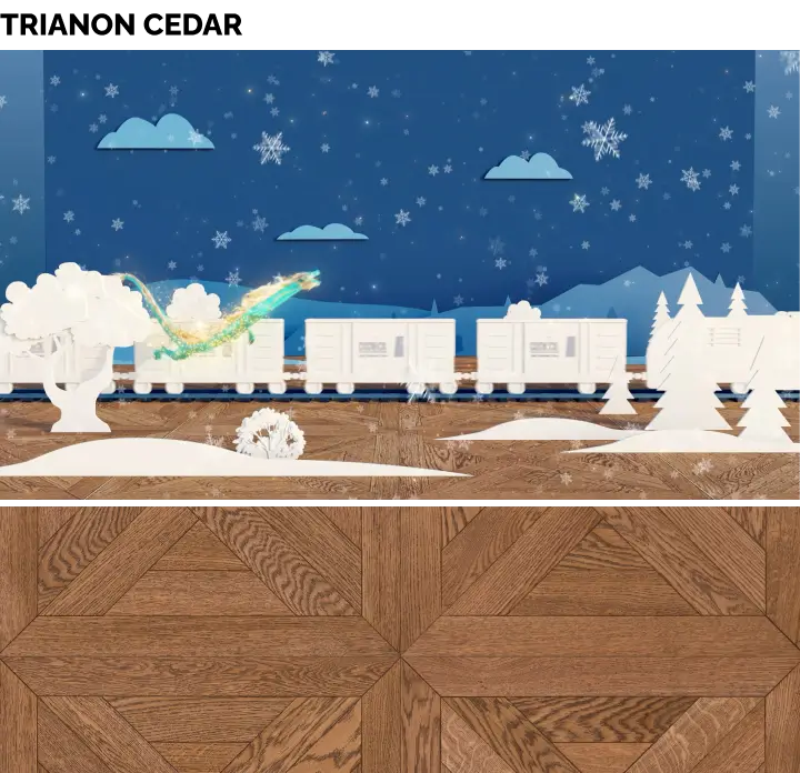
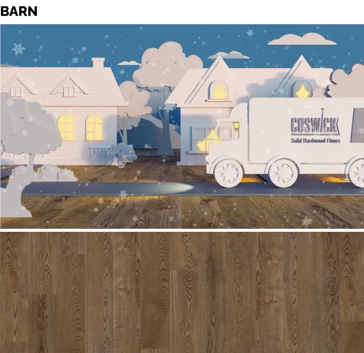
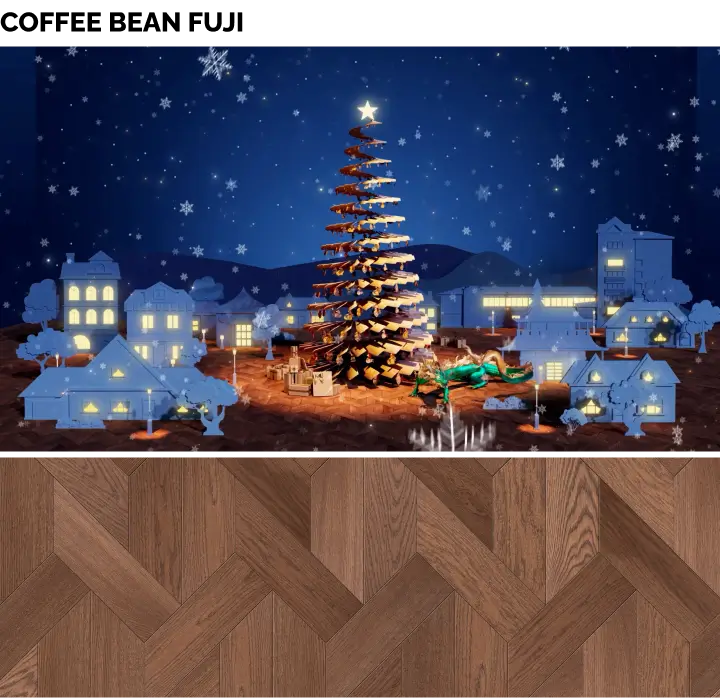
Parquet and Texture Design
Each scene features a distinct floor texture selected from Coswick’s flooring collections. These aren’t just decorative — they are a part of the visual storytelling.
Every plank serves as a recognizable element of Coswick’s identity. In the final scene, a Christmas tree is built entirely out of Coswick parquet planks, adorned with wooden ornaments — the brand’s handcrafted holiday souvenirs.
Paper World and Animation
Buildings, landscapes, and all objects were created in a paper craft style, evoking the feel of children’s pop-up books. We used custom-made textures and lighting setups to simulate hand-cut elements.

Animation and motion design brought this paper world to life — making still images move, appear, and disappear with rhythm, energy, and festive warmth.