The packaging design for the “Multitel” beverage line was created as a cohesive visual system to reflect the freshness and variety of its juice-infused flavors.
The goal was to help the brand stand out on the shelf, highlight the natural quality of the drink, and build an emotional connection with consumers.
As a result, packaging was developed for three flavor profiles:
- Tropical Fruits
- Watermelon & Mint
- Coconut & Pineapple
The “Multitel” Logo as a Core Element of the Visual System
The logo for “Multitel” plays a key role in the visual identity of the brand. Its central feature — stylized leaf shapes — symbolizes natural freshness and origin.
The design is geometric and clean, ensuring strong recognizability on the shelf. A modern, minimal typeface makes the wordmark easy to read across all types of packaging.
The packaging graphics and the logo are united by a shared stylistic approach, reinforcing brand consistency and visibility in the beverage category.
Fruit Label Design: The Visual Language of Flavor
The goal of the label design was to create clear flavor associations and boost emotional engagement.
Each label tells its own story:
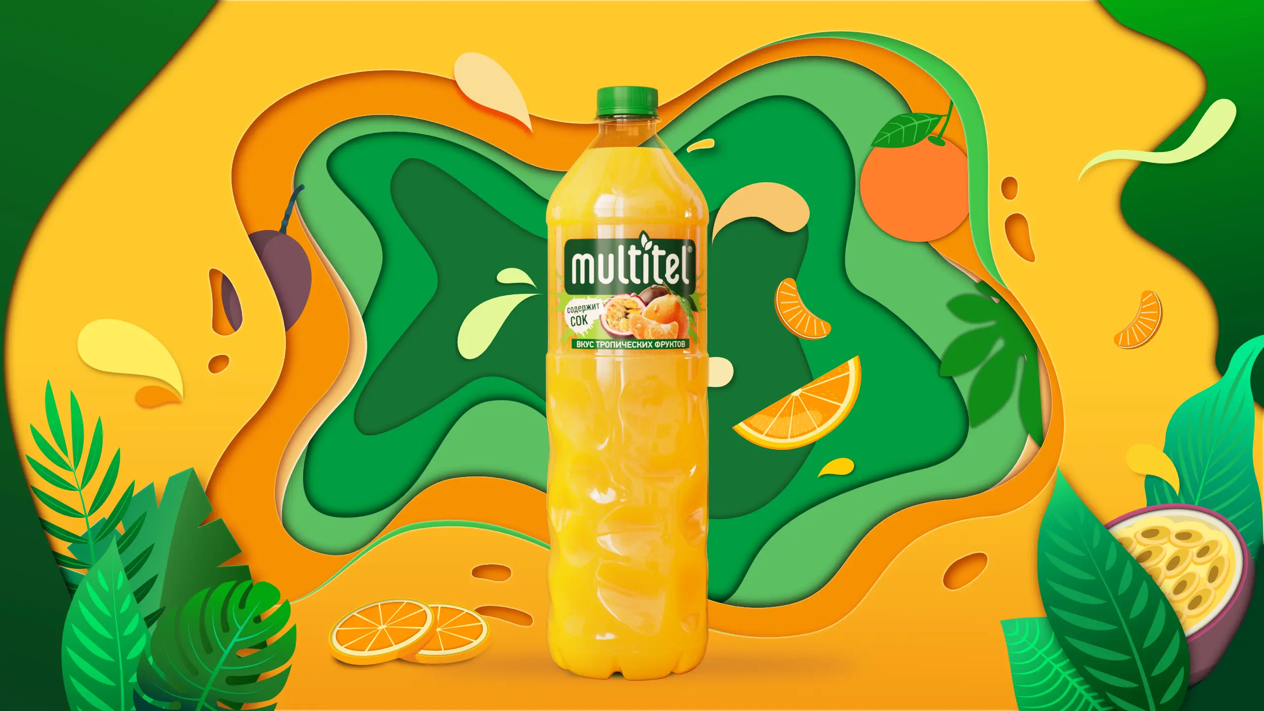
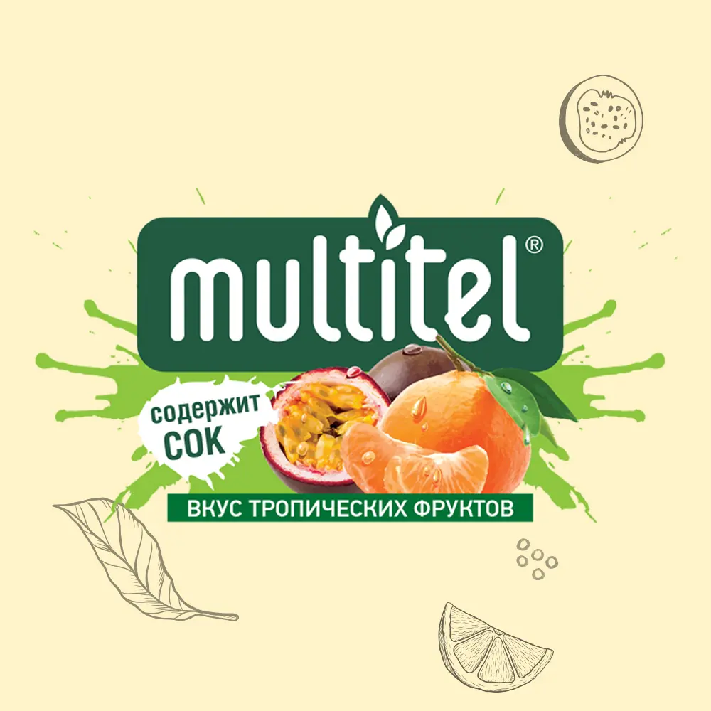
Tropic Flavor: Mandarin and Mango
The label features juicy slices of mandarin and mango chunks in a vibrant yet natural palette. The colors are rich but not overwhelming, and the graphic conveys both freshness and sunshine.
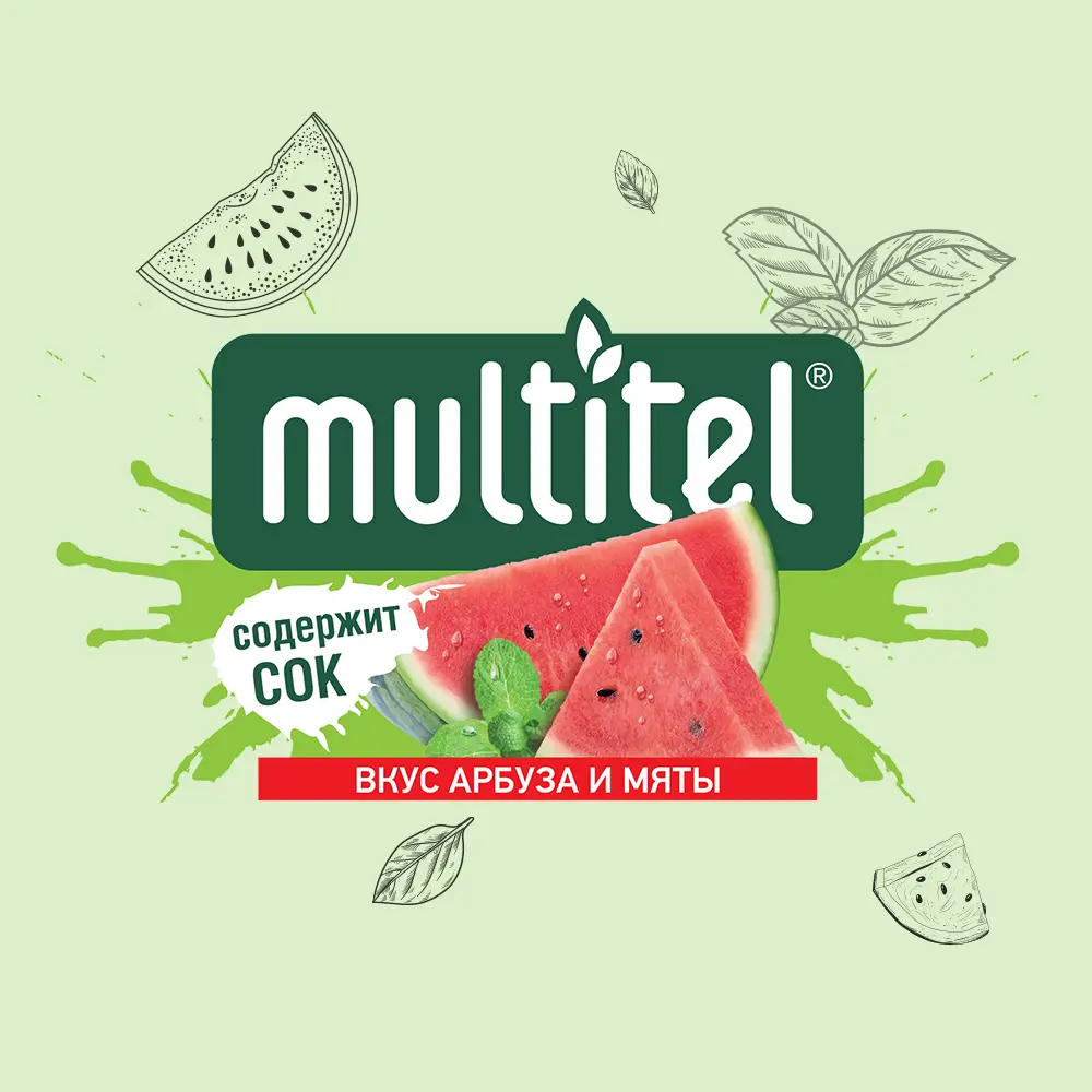
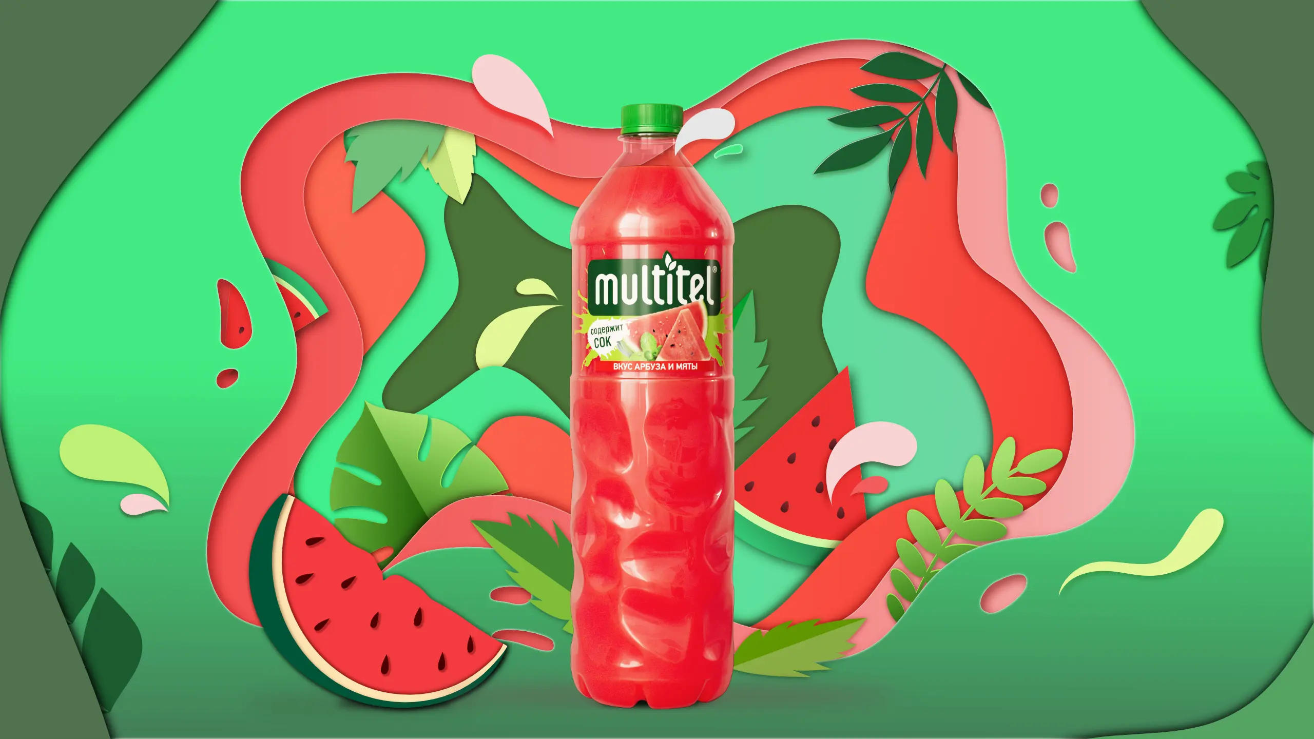
Watermelon-Mint: Refreshing Contrast
A bold mix of red and green highlights the refreshing character of this flavor. Watermelon slices and mint leaves create a cool, crisp visual effect.
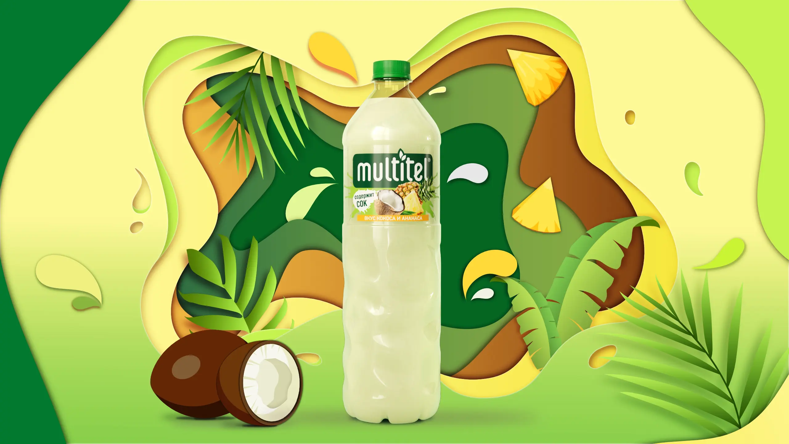
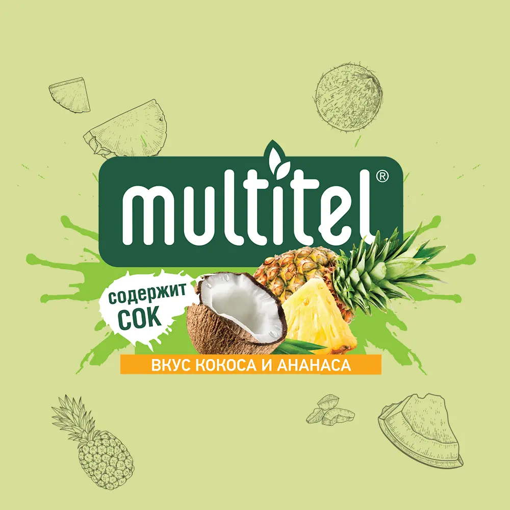
Coconut-Pineapple: Tropical Aesthetic
Beige and yellow tones, coconut textures, and pieces of pineapple take you on a tropical escape. Fruits are placed to visually emphasize the “flavor you can see.”
A Flavor-Driven Experience: How Packaging Captures the Atmosphere of the Drink
The approach was strategic and insight-based:
- Researched current beverage packaging design trends
- Considered consumer behavior patterns
- Built a visual language that’s clear at first glance
The Multitel packaging design balances visual storytelling, legibility, and intuitive flavor communication. Key design elements, the color palette, typography, and iconography are all carefully thought out.
This approach doesn’t just decorate the packaging — it turns it into a selling tool that builds brand loyalty.