In the food industry, a strong brand identity is just as important as in any other business.
For OJSC “1st Minsk Poultry Farm”, we developed the OMEGGA eggs brand, combining naming, packaging design and visual identity to highlight the Omega-3 benefits and make the product stand out on the shelf.
Naming: a simple wordplay with ``egg``
The name OMEGGA was born from combining omega and egg. By adding an extra “g” inside “omega,” we revealed “egg.” This made the brand name both memorable and informative: it connects the product directly with its category and emphasizes its health benefits.
Logo and packaging design
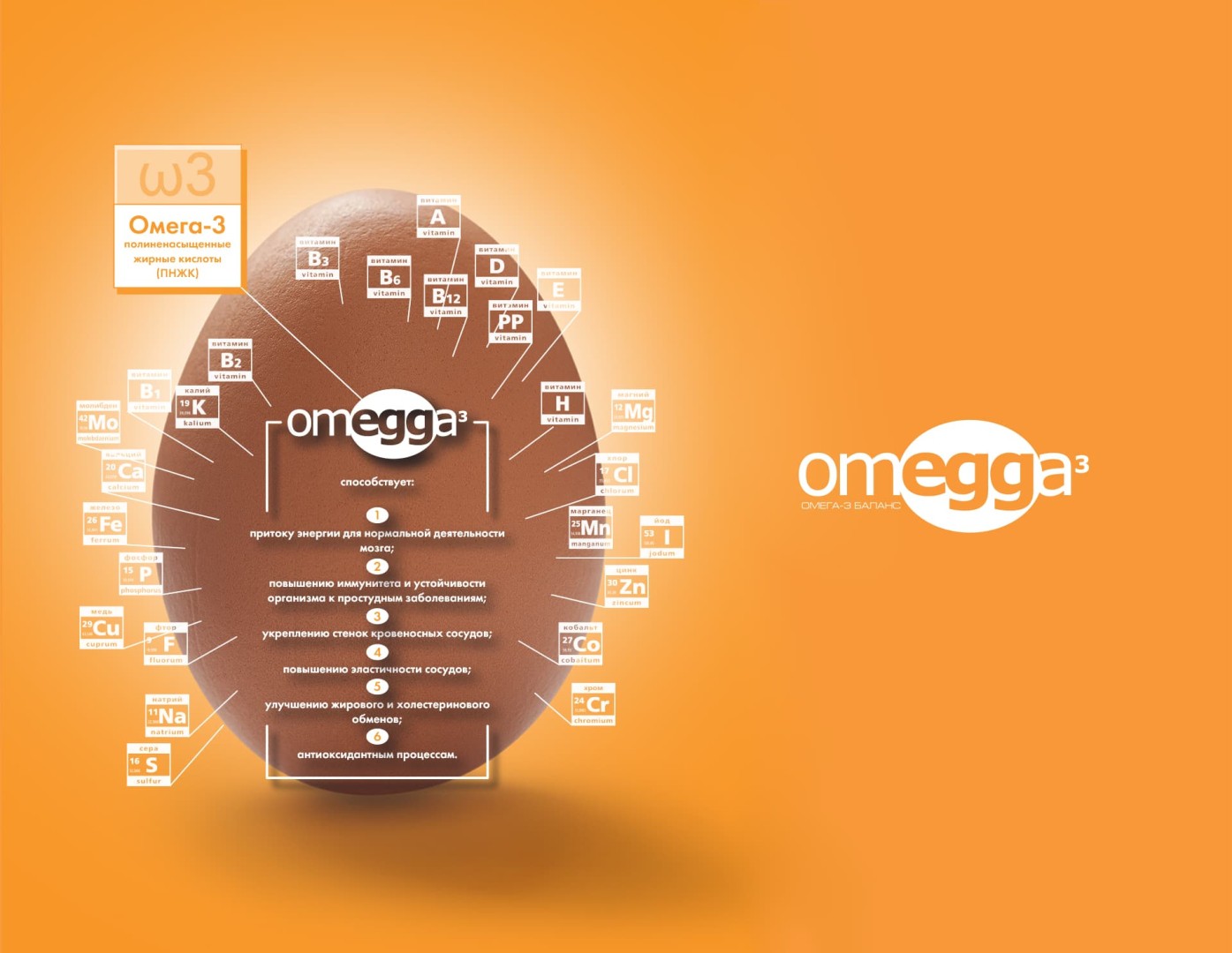
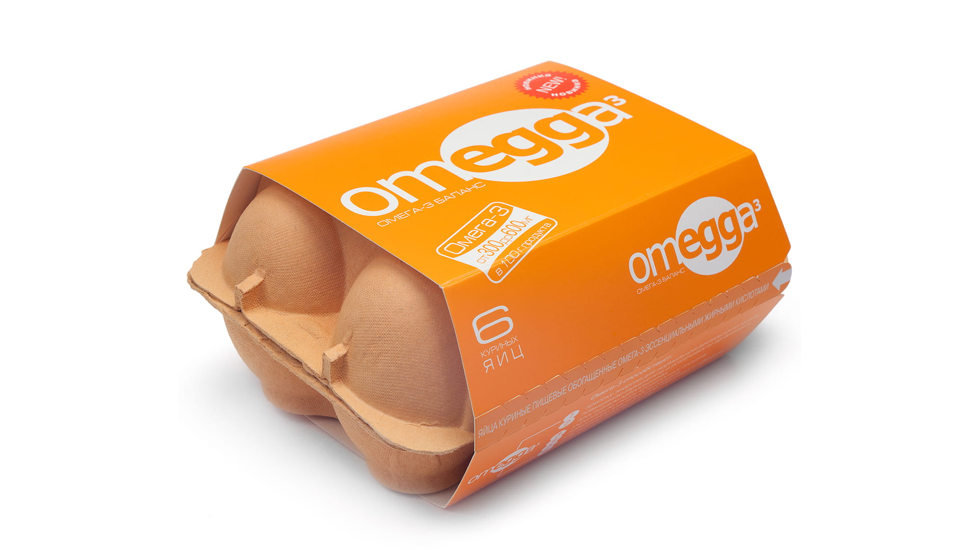
The brand’s visual code is based on a strong yet simple image – the egg silhouette – integrated with the word omega. For the packaging, we chose a bright orange palette and clean typography. This contrast ensures OMEGGA is instantly recognizable and visually striking on the shelf.
Communication materials
To support the launch, we developed infographics and advertising materials that explain the health value of Omega-3 in a clear and accessible way. OMEGGA eggs contain up to 600 mg of essential fatty acids, offering a convenient alternative to fish for people seeking balanced nutrition. From informative vitamin infographics to surreal underwater posters, the visuals reinforced the brand’s positioning.
Brand impact
The OMEGGA project shows how a comprehensive branding approach can give even a simple product like eggs a powerful identity and market presence. A distinctive name, eye-catching packaging and consumer-focused communication created a brand that is both noticeable and memorable.
OMEGGA is a clear example of FMCG branding, where packaging and visual style directly influence the consumer’s choice at the shelf.